Building for One, Part one: a calm iPad display for someone living with dementia built a calm daily display for someone in the early stages of dementia, and Building for One, Part four: the £200 tablet that just worked put it on a £200 tablet. In between, two parts on turning it into one command that ships to both stores and on how much of the design real tablets proved wrong. This part covers the week after that: twenty-five beta builds, and the same app sitting in three review queues at once.
Almost none of that week was spent on the thing the app does. It was spent on the fact that three different people read this app before the person it is for ever sees it (an app reviewer, a tester, and the family member doing the installing), and each of them needs different words.
TL;DR – Getting those words wrong does not produce a bug report. It produces a rejection, or worse, a person reading something about themselves that nobody meant them to read.
Contents
- Twenty-five builds in a week is not thrash
- The screen a reviewer opens has nothing on it
- Then we took a paragraph back out
- A reviewer meets the sample, and nothing else
- The word that must not appear on her tablet
- Erase All is called All for a reason
- The Cancel button that was not a button
- A corner you could not find on a phone
- Thirty seconds had quietly become three minutes
- Read the widget before you theme it
- A weather line that asks for no permission
- Screenshots that were upside down and passed every check
- Amazon
- What went in instead of a Settings bundle
- What we deferred to get it out of the door
- Ten days, from the first commit to her iPad
- Where it stands
- The real test starts now
Twenty-five builds in a week is not thrash
It looks like thrash written down. It was not, and the distinction is worth making because the cadence is deliberate.
Every one of those builds went to a real device through the store channel it will eventually ship through: TestFlight, Play internal testing, and latterly Amazon Appstore for the Fire tablet. None of them went on by dragging a binary onto a device. That rule costs about six minutes a build and it has caught things that no simulator run would have: a corner you cannot tap, a timeout that had quietly tripled, a dialog button that did nothing at all.
The pattern that has emerged is short loops on real tablets, and closing each day by writing down what changed. This series is partly a by-product of that habit rather than a thing done alongside it.
The screen a reviewer opens has nothing on it
Here is a problem this product has that most apps do not.
Daysome opens on a display with no buttons, no fields, and nothing to tap. That is the entire design. It is also, to somebody whose job is to open forty apps a day and decide whether each one works, indistinguishable from an app that has failed to load. And “no way out” is a rejection reason in its own right, not a bug they file, a rejection they issue.
So a substantial piece of this week was a review note, pasted into three different fields with three different names: App Store Connect calls it App Review Information, Play calls it App access, Amazon calls it Testing instructions. It says what the empty screen is, and then it says how to get out of it: tap five times in the top-right corner within five seconds, then choose a four-digit PIN.
The five seconds used to be three. Three was measured on a fast phone by someone who knew exactly where the target was. On the sort of iPad this actually runs on, held by someone doing it for the first time, three seconds is genuinely hard. That change had to propagate into the review note as well as the code, because a reviewer following stale instructions is looking at an app that will not let them in and has no reason to think that is their own mistake.
That is the general shape of the whole week: a number in the code is now also a number in three store consoles, and they have to move together.
Then we took a paragraph back out
The review note originally carried a paragraph about medication. It said the app shows no dose, no drug name, and no clinical instruction, makes no medical claim, and is not a medical device.
The reasoning for including it seemed solid: a reviewer opening a dementia app is going to wonder about exactly that, so answer it before it is asked. We wrote that reasoning down, at some length, in the listing document.
Then the sample data changed (more on that next), and the paragraph became actively counterproductive. There is no medication anywhere in what a reviewer sees. A review note is read against what is on the screen, so raising the subject does not solve a problem; it introduces one, and points a careful reviewer at a claim the app never makes.
So we took it out. The position itself has not changed and is still written down where it does work: in the full description, and in the answers to the content rating questionnaire. Only the route map lost it.
The lesson is not about medication. It is that a defensive paragraph is priced against what the reader can see, and that price changes when the product does. We had written down the argument for including it and never revisited that argument when its premise moved.
A reviewer meets the sample, and nothing else
The app ships with an example household so that a full day is on screen at first launch with nothing to set up. That sample had pills in it: a morning line and an evening one, which is what the first real family actually needs.
A reviewer will never see anything else. They will not add their own data, and they should not have to. So the sample is not test data; it is the product, as far as the only person standing between us and a store listing is concerned. A screen with medication on it is an invitation to ask whether this is a medical device, and that is a conversation to avoid having by construction rather than by argument.
What went in instead is a television programme: Last of the Summer Wine, six o’clock, channel 20, weekdays only.
It demonstrates exactly the same thing the pills demonstrated (a fixed point in the day that is not a meal, on a recurrence that is not every day), and it demonstrates it better. The channel number is a genuinely useful piece of information, of the kind this app exists to hold. It is also the first sample line that made someone smile, which is not nothing when the surrounding subject matter is what it is.
The app still supports medication. A household that wants a reminder gets a named line and a time, and nothing more: no dose, no drug name, no instruction, and no record of whether anything was taken. The pill box remains the only thing that knows.
The word that must not appear on her tablet
This is the decision this week that we would most want someone else to steal.
The app is going to be installed on an iPad that already belongs to the person it is for. That is the whole premise: it is her device, with her photos on it, and the display is one more thing it does. Which means she will, at some point, wander through the parts of that device we do not control (the TestFlight app, an email invitation, the store page) on her own, with nobody there to frame it.
Everything written for testers and reviewers had been written as though only testers and reviewers would read it. It said dementia, repeatedly and matter-of-factly, because it was describing the product to a professional audience.
So the rule is now explicit: nothing she can reach by accident on her own device may label her. The TestFlight description, the What to Test notes, the store listing, the app name, the icon caption. The carer-facing text inside the app was already gender-neutral after an earlier pass; this went further out, into the parts of the experience that are not ours.
The review note is exempt, because the App Review Information field is genuinely private to the reviewer. The Beta App Description is not exempt, because TestFlight shows it to anybody who opens TestFlight. Those two fields sit next to each other in the same console and have completely different audiences, which is not obvious and is not signposted.
Erase All is called All for a reason
The example household needs to be removable, or a family’s first job is deleting somebody else’s fictional lunch. So there was a button to clear it.
The button was wrong, and the correction came from the person who will actually support this app in a house. Clearing the example and wiping the household are two different operations with two different consequences, and the second one must not be reachable by somebody aiming at the first.
They are now separate, under a settings page called Reset your Data:
| Operation | What goes | What stays |
|---|---|---|
| Clear the example | The sample day, menus and note | Anything the family entered, and the PIN |
| Erase all content and settings | Everything, including the PIN | Nothing |
Erase all clears the PIN too, which was the specific instruction, and the reasoning is exactly right: if it does not, the device is not actually reset. It is handed on with somebody’s four digits still on it, and the next person cannot get in.
Both sit behind a confirmation. Both had to have their confirmation dialogs given explicit text sizes, because the ambient theme in this app is scaled up for older eyes and a system dialog inherits that scaling in ways that are occasionally comic.
The Cancel button that was not a button
The best bug of the week, in the sense of being the most instructive.
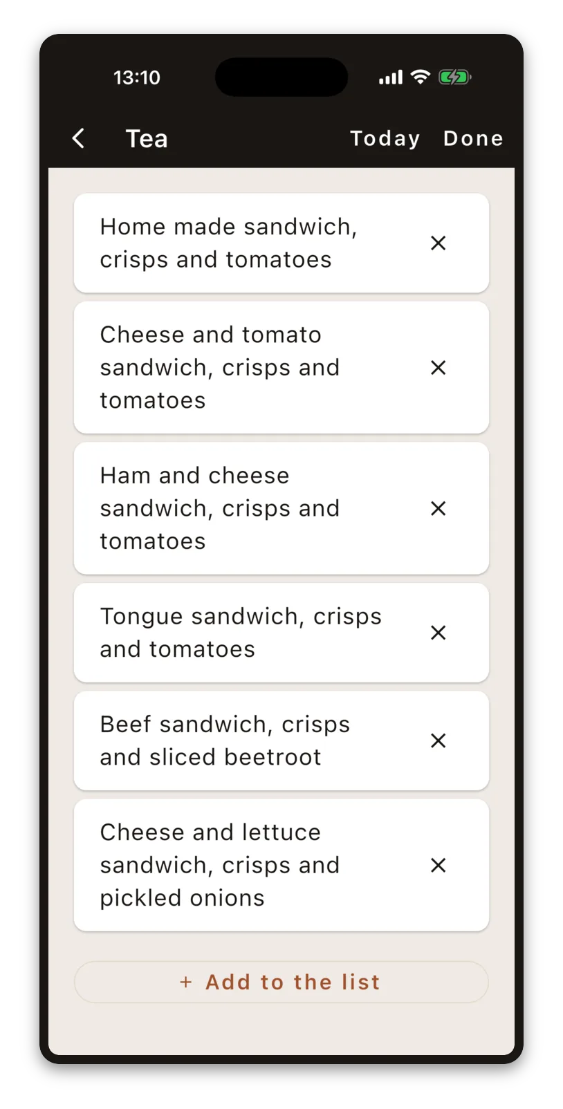
The dialog for adding a meal to the list was too narrow on an iPad: CupertinoAlertDialog is fixed at 270 points, which is fine on a phone and absurd on an 11″ screen. So it was rebuilt on CupertinoPopupSurface, which lets you choose the width.
Everything looked right. Cancel did nothing at all, and since the dialog was modal, that left the app unusable until it was force-quit.
The cause: CupertinoDialogAction has no gesture recogniser of its own. Inside a CupertinoAlertDialog the parent wires up the taps. Lifted out into a custom surface it still renders perfectly, still reports itself to accessibility as tappable, and does nothing when pressed. It is a button in every respect except the one that matters.
The part worth sitting with is the test. There was a widget test covering this dialog. It passed. It asserted that the dialog appeared and that the Cancel button was present, and it never pressed it.
That is a whole category. A test that checks a control exists is testing the layout. Only a test that uses the control is testing the control. The test now taps Cancel and asserts the dialog is gone.
A corner you could not find on a phone
The way into supervisor mode is five taps in the top-right corner. The target is invisible on purpose: anything that looked tappable would be one more thing for the person to wonder about.
On Android, on a phone, it became impossible to get back in after adding a meal.
The target was a square. On a tall phone screen, the date card in the corner is taller than that square (by around a hundred points), so a natural tap aimed squarely at the visible landmark landed below the invisible target every time. The user was doing exactly the right thing.
It is now sized in two dimensions rather than one, with a floor of 120 points and a height that scales with the screen:
static Size _cornerSize(BuildContext context) {
  final size = MediaQuery.sizeOf(context);
  final side = (size.shortestSide / 3).clamp(120.0, 240.0);
  return Size(side, math.max(side, size.height * 0.28));
}
No widget test would have caught this, and it is worth being precise about why. The test environment uses a fallback font with different metrics, and in that font the date card sheds a line and fits inside the square. The test was not wrong; it was measuring a screen that does not exist.
It was found by driving a release build on a real phone over adb. That is now the pattern for anything that will not reproduce: build release, put it on hardware, and assert what a person can actually see.
Thirty seconds had quietly become three minutes
Settings close themselves after thirty seconds without a touch, so that a carer called away cannot leave the iPad sitting on an editing screen where the person who's device it is will find it.
Some screens legitimately need longer. Planning a week of meals is not something to do in thirty seconds, so those screens got a longer timeout.
Then the exemption grew. Each addition was individually reasonable, and by the end of it nine screens were on the long timeout, which is very nearly all of them. The thirty-second rule had become a three-minute rule everywhere, and it was documented as thirty seconds in three separate published texts.
This was reported by a tester, not caught by us: it is taking a lot longer than thirty seconds to return to the display. The exemption is now two screens.
The failure mode is worth naming. No single change was wrong, there was no bug, and every commit passed. A rule with a growing exemption list decays into no rule at all, and it does it without ever producing a red build.
Read the widget before you theme it
A small one, included because the time it cost was out of all proportion and the lesson generalises.
Flutter apps should carry a third-party licences page, and LicensePage gives you one for free. Ours came out in a pale lavender that belonged to no palette in the app.
Three rounds were spent guessing: surface, then the surfaceContainer family, then whether it was falling back to Material 2 defaults. All wrong. LicensePage paints from Theme.of(context).cardColor, which is a legacy property that our theme never set, so it was using a default derived from the seed colour.
Reading material/about.dart would have taken two minutes. When a framework widget looks wrong, read the widget. The source is right there, and guessing is a good way to waste an hour.
A weather line that asks for no permission
One feature did land this week. The sentence under the date now says what sort of day it is for real (warmer than yesterday, rain later) rather than from a placeholder.
It uses Open-Meteo, which needs no API key. Comparing to yesterday is the interesting bit: a forecast endpoint gives you tomorrow, and what this sentence needs is yesterday actually happened and today will be warmer than it was. Open-Meteo will return past days alongside the forecast in one request, which makes the comparison a single call.
The app never asks the device for its location and holds no location permission. A carer types a town name in the settings; the app asks about that town. This started as a privacy decision and turned out to also be the right product decision, because the tablet does not move and the person never sets it up.
If no town is named, or there is no connection, the line is simply absent and the rest of the display is unchanged. Open-Meteo is CC BY, so there is an attribution on the settings page, alongside a preview of every phrase the rules can produce, which was requested, and immediately earned its place by making it obvious how few of them there were.
Screenshots that were upside down and passed every check
Store screenshots are scripted rather than taken by hand. The scripts boot an emulator or simulator, install a release build, drive the app to a known moment, and capture. If you are not doing this with your apps you are wasting hours and making repeatable identical screenshots unnecessarily fragile and difficult.
That change has been worth more than it sounds. The old approach was a written playbook and a great deal of careful clicking, and a full set now runs to three stores and six device classes. Scripted, even with the manual steps that remain, it is a command and a wait rather than an afternoon. The real gain is not the time saved once: it is that regenerating the whole set after a small design change stops being a decision. You just do it, instead of quietly concluding that the old ones will do.
The iPad set came out rotated 180 degrees. It passed every check the script had, because every check was about shape: the image was landscape, it was the right pixel size, and the app filled it. Upside down is landscape.
The guard that catches it is a measure of ink asymmetry: this layout is much busier at the top than the bottom, so the ratio of dark pixels in the top third to the bottom third is somewhere between 5 and 25 the right way up, and about 0.2 upside down. Crude, and it has not produced a false positive.
The Android set had a different version of the same problem: one tablet slot captured in portrait. The cause is genuinely obscure and worth passing on. On a freshly created emulator, the settings provider writes its defaults asynchronously after boot completes, so accelerometer_rotation goes back to 1 some seconds later. With auto-rotate on, the requested rotation is ignored and the simulated sensor decides, which is portrait. The device had been checked, was landscape, and had quietly turned back by the time the app launched.
Rotation is now asserted immediately before every shutter rather than once per device. A screenshot of the wrong shape is worse than no screenshot, because it looks plausible in a listing and nobody checks it again.
Amazon
Part four was warm about the Fire Max 11 tablet, and that stands: the build ran first time and the hardware is remarkable value for the money. The submission process is a different experience, and it is fair to say it compares poorly with both App Store Connect and the Play Console.
Four things caught us, all of them avoidable with prior knowledge and none of them discoverable in advance:
Screenshots must be one of seven exact sizes. Play takes whatever shape the device genuinely is; Amazon publishes a closed list and rejects anything else. Ours were 2000 × 1125 off the Fire Max 11, which is not on it. That one is exactly 16:9, so 1920 × 1080 is the same shape and the fix is a clean downscale with no crop and no padding, but only by luck. The script now resizes into the list automatically, and refuses outright if a shot is ever a shape the list does not contain, rather than squashing it to fit. A distorted screenshot uploads perfectly happily and then looks wrong forever.
Two icons, both wanting transparency, for artwork that has none. Amazon asks for 114 × 114 and 512 × 512 PNGs “with transparency”. Our icon is full-bleed (a window on a warm ground), so nothing is cut out. What is actually being asked for is a file that carries an alpha channel, so both are written as PNG32 with alpha set and every pixel opaque. The temptation to knock the background out and ship the window on transparency should be resisted: it would then sit on the Appstore’s own background rather than ours, and the ground is half the icon. Both are rendered from the SVG at target size rather than downscaled from the master, because at 114 pixels a downscale turns the window mullions to mush.
A DRM question with a real answer. Amazon offers to wrap the binary so it checks entitlement against the Appstore client at launch. We said no. It is a free app with no purchases, so there is nothing to protect, but the real reason is that it adds a launch-time failure mode to an app that must not have one. The app is built to work with no network at all, and we say so in writing to all three stores. A person in the early stages of dementia looking at the tablet to find out what day it is, and meeting an entitlement error instead, is the product failing in the one way it cannot be allowed to fail. She could not act on that dialog and would not report it.
And the one that actually cost us something. Amazon does not give you the binary back. The console is upload-only: it takes the bundle, generates and signs the APKs, and offers no download of what it produced. The way to get the real Amazon-signed build onto a device is Live App Testing, which invites testers by email and installs from the Appstore page: the genuine customer artefact.
The Submit Test button is inactive while an app is in the submitted, approved or review state. We had already submitted. So the Amazon build cannot be put in front of a tester until it comes out of review, which is a whole cycle lost to an ordering rule that is documented, but only in a place you would read after you needed it.
Start Live App Testing before submitting. That sentence is now in our own documentation, which is the only place we will reliably read it.
What went in instead of a Settings bundle
A question came up worth recording: is it a problem not to appear under the system Settings app on iOS?
The recommendation was no, and to leave it alone. All of this app’s settings are behind a PIN precisely so that the person using the device cannot reach them, and a system settings pane is reachable by anybody holding the iPad. Putting them there would undo the thing the PIN is for.
What did go in is a licences page and the version and build number, both behind the PIN: standard practice for a Flutter app, useful when somebody reports a problem, and visible to nobody who should not see it. Whether App Review agrees is one of the things currently being found out.
What we deferred to get it out of the door
Part three ended on an uncomfortable finding. If the iPad is in her hands rather than propped somewhere she will see it, the display cannot be the primary channel: she has to pick it up and look, and nothing prompts her to.
The complete answer to that is a local notification, which reaches her wherever the tablet happens to be. It is deferred, along with the home screen widget, and that was a decision rather than a slip.
What shipped instead is a chime inside the app. One soft tone when something becomes now: deliberately not a doorbell and not an alarm, never repeated and never escalating. It only sounds while the app is on screen, which reads as a serious limitation and is a smaller one than it looks: this is a device that sits on this app all day, and under Assistive Access it is very nearly the only app that opens at all.
It is still a real limitation and we would rather say so than dress it up. If the iPad has been put down in another room, the chime is in that room too.
The reasoning is that a first release which exists beats a complete one that does not. Everything else in this piece (the review notes, the sample data, the language, three sets of store assets) is work that only pays for itself when somebody outside this project is holding the app. Notifications and a widget can arrive in a release that goes to people already using it. The alternative was another month of building, with the same three review queues still waiting at the end of it, and still no idea whether any of it is right.
One detail worth passing on, because it took a few attempts. The chime uses the audio category that plays through silent mode, on purpose. A day display that has gone quiet because a setting was changed weeks ago is a day display that has stopped working, and nobody in the house will connect those two facts.
Ten days, from the first commit to her iPad
It is worth marking the timetable, because it surprised us.
The first commit was made on the evening of 21 August. Two days later the first tagged build went to TestFlight through the pipeline part two describes. Twenty-five build numbers after that, one bundle went to all three stores at once. And today, ten days after that first commit, the app is live on the Amazon Appstore, approved for external TestFlight, open for testing on Google Play, and installed on the iPad of the person it was built for.
Three platforms: iPadOS, Android, and Fire OS. One hundred and fifty-nine commits. Twenty-five build numbers and twenty-four tags, because one build never made it out of its own pipeline.
What made it possible is worth separating from what made it fast. There is no backend, no accounts, and no server to stand up. The requirements came from one household rather than a committee, which meant the questions had answers the same afternoon they were asked. And the release pipeline was built on day two, before there was anything much to release, which is the decision that paid for all of it: every one of those builds reached a real device through a store channel, and the ones that mattered were driven by somebody who was not us.
The part we did not control at all came at the end. Three review queues, on three timetables nobody publishes, and they happened to clear inside a week. That is luck rather than planning, and the point of the section above is not to confuse the two.
Where it stands
The same build went into three review queues: App Store Connect for external TestFlight, Google Play for open testing, and the Amazon Appstore. Version 0.1.0, build 25.
Google Play cleared first, which is the reverse of how this used to go. Apple's beta review was a couple of hours not that long ago and had become overnight or longer, and we had quietly planned around the old order.
Then Apple came back in about twenty-four hours, a day behind Play. Which made us wrong twice, in opposite directions, inside a single week.
That is the more useful observation, and it is not really about Apple. These timelines cannot be predicted from last time, cannot be escalated, and cannot be paid to move. A submission goes into a queue you have no visibility into and comes out when it comes out. The only variable genuinely within your control is whether everything else is finished when the queue moves, which is what this entire week was, and why it stopped feeling like an unreasonable amount of paperwork somewhere around the third store's screenshot rules.
Amazon went live first, which we did not expect at all. You can find the listing here: https://www.amazon.co.uk/gp/product/B0HH1F62SQ?tag=multizoneltd-21. Amazon say it works and passed their functionality validation test so please do download it if you have a Fire HD 8 (2024), Fire HD 10 (2023), Fire HD 8 (2022), Fire HD 8 (2020), Fire 7 (2022), Fire HD 10 (2021), Fire HD 10 Plus (2021), Fire 7 (2019), Fire Max 11 (2023), Fire HD 8 (2018), Fire HD 8 Plus (2022) / Fire HD 8 (2024), or Fire HD 10 (2019). Quite the list. We've only tested the Fire Max 11 (2023)!
Almost everything described above is paperwork, sample data, wording, and tooling. The app itself changed relatively little this week, and that is the honest shape of the week before a first submission: something we would have found useful to read beforehand and hope you do too.
And Assistive Access is confirmed working. Apple’s iPadOS mode for people with cognitive disability was the largest open question in this project for most of its life, and it closed this week. It costs exactly one Info.plist key (UISupportsFullScreenInAssistiveAccess), and with it a Flutter app is listed as optimised in the setup flow and runs full-screen, rather than letterboxed beneath a system back button.
We had doubted that for a reason that seemed sound: Apple’s Assistive Access API is SwiftUI-shaped, and Flutter renders into a plain UIViewController, so it looked like it would need native work or a platform channel at minimum. It needs neither. The doubt was reasonable but completely wrong, which is worth recording in both directions.
The more useful half is that it kept working. It was first confirmed several builds ago, and the carer’s half of the app has been rebuilt twice since: the whole supervisor section restructured into a menu, then a reset page added underneath it. Assistive Access is a narrower box than a normal app, so none of that was safe by default, and it survived all of it. Claiming the key is the easy part; the ongoing cost is checking both modes on the same build before calling any change done.
It matters more than compliance, because Assistive Access survives a restart and Guided Access does not. A flat battery, or somebody unplugging the iPad to vacuum and forgetting, leaves a Guided Access device back on its ordinary home screen, and usually nobody notices until someone goes looking for the day and it has gone. That is the question every household reaches eventually, and the iPad has a real answer to it.
One detail worth passing on, because we could not find it written down anywhere and had hedged against the opposite. Links do work inside Assistive Access. The settings page has two credit links (one to the weather provider, whose licence asks for it, and one to our own site), and we had assumed there might simply be no browser to launch, because Assistive Access curates which apps exist. They open in a constrained browser, almost a kiosk mode, and it closes back to the app rather than releasing the iPad into the rest of itself.
This is the right behaviour, and better than we expected. We are keeping the design that hedged against it (the links show their full address in the label rather than hiding it behind a word), but for a different reason now: a visible URL is what lets somebody type the address on a machine they actually browse on, which is the realistic way anybody follows a credit from a tablet in a kitchen.
With that, nothing in the app is unseen on Apple hardware.
The real test starts now
She has it. It went onto her iPad this week and she likes it, which is the first judgement in this whole series that was not our own.
Two things she noticed, unprompted, and both were late additions. She likes that it tells her whether it is warmer or colder than yesterday, which was a placeholder phrase until we added the API call to Open-Meteo. It became real because I realised it is one of her first questions each day, and thought it would be good to add the answer, as an aide-memoire. And she likes that it knows her menu, which is the meal list, and which began life with a limited design: the household's own dishes were split so that something eaten at lunch could not be chosen for tea.
So two things she picked out are a feature we nearly did not build, and a restriction we discovered through real testing needed a more flexible design. Neither was in the plan. That is an argument for shipping to a real person earlier than feels comfortable.
It is also one person, on the first day, and liking something is not the same as it working for the longer term. Everything up to here has been us deciding what somebody else needs, checked against one household and our own judgement. That has been enough to build something. It is nowhere near enough to know whether it is right.
So this is the point where it stops being ours. If you support someone in the early stages of dementia who is still living independently, or you work in dementia care and would be willing to tell us plainly where we have got it wrong, we would like to hear from you.
Daysome is available now and is designed for tablets but also works on phones:


Plainly, so nobody is misled: Daysome is an app centred on a display that shows the day. It is not a medical device, not a monitoring system, and not a substitute for anybody. It does not track medication adherence and it never will.