Building for One, Part one: a calm iPad display for someone living with dementia built a calm daily tablet display for someone in the early stages of dementia. Building for One, Part nine: the free tablet and the paid household built the server that lets a family change the day from somewhere else, and Building for One, Part ten: the chime that follows her out of the app took a detour to make the chime reach her in another app. This part is about what came after the code was finished: getting a paid plan in front of three stores’ reviewers.
It took two days. Very little of it was programming, and the programming that did happen was mostly the build breaking in ways we had not seen before.
TL;DR – A store review checks that everything you say about an app agrees with everything else you say, and with what the app does. Once the app holds an account and takes money, that is a lot of things to keep in agreement, and most of them are not code.
Contents
- What “ready” turned out to mean
- The privacy policy had to stop saying “collects nothing”
- Three stores, three dialects of the same questions
- A reviewer has to be able to reach the purchase
- The website got ready for visitors
- Photographing a screen that costs money
- The build broke three times
- One rule we did not know
- Where it stands
- Getting it, and telling us where we went wrong
What “ready” turned out to mean
By the start of this week the household plan worked. A tablet could be connected to a household on daysome.org, the family could change the day from a phone, and the plan could be bought in the app, yearly or once, through Apple, Google or Amazon. Testers had been trying it on TestFlight and Google Play’s internal track.
Ready for review meant something else. It meant a privacy policy that told the truth, three sets of store questionnaires that agreed with it and with each other, a way for a reviewer who has never seen the app to reach a purchase hidden behind five taps, a PIN and a code typed on another device, screenshots of a paid screen without showing a wrong price, and a build that would actually build. Each of those turned out to be a small project.
The privacy policy had to stop saying “collects nothing”
The policy on daysome.org opened with a sentence we were proud of: the app collects nothing, makes no network requests, and everything it knows stays on the tablet. It had been true. It stopped being true when the weather arrived, a month ago, and again when the household server did. Nobody had noticed, because the sentence was still true of the app most people had installed.
So it was rewritten around three cases, each with what it sends and to whom. On its own, the tablet keeps everything. If a carer names a town, the app sends that town’s name once to a weather service, then its position, rounded to about a kilometre, every few hours. If the tablet is connected to a household, the family’s own words are kept on our server in the UK, the people in the household have accounts, and the store’s receipt goes to the service that checks purchases for us.
We wrote it from the code, not from memory, and that caught two more mistakes. The policy said the iPad asks for no permissions, but the chime’s “even in another app” switch from part ten asks for notifications. And the home page still gave a medicine as its example of something a family might put on the day. Daysome has never stored anything about medicine, and we would rather a reviewer never had a reason to ask, so the example went. A family can still add a reminder of their own, in their own words; the app never asks what it is for.
Three stores, three dialects of the same questions
Apple calls it App Privacy, Google calls it Data safety, and Amazon asks a shorter version of Google’s. They all want to know the same things: what is collected, whether it is linked to a person, what it is used for, and whether anything is used to track people. The words are where it gets interesting.
An identifier we assign is still an identifier. Our first answer was that the household’s code and the tablet’s code are ours, random, and identify a household and a device rather than a person. That is not how either store reads it. To Apple, any account-level code is a user ID and any device-level code is a device ID, whoever made it. The tablet’s heartbeat, which tells the family when it was last touched so they can see it is in use, is what Apple calls product interaction. All declared, all for the app’s own function, none for tracking.
A town somebody types is not their location. The weather town is typed by a carer, need not be where the tablet is, and the app has no permission to ask the device where it is. We did not declare it as location, and wrote down the more cautious answer in case a reviewer disagrees.
Google’s form has a question that looks optional and is not. We answered no to “do you provide a way for users to request that their data is deleted”, thinking it meant deleting some data while keeping the account. It is the general question. With a self-service account deletion page already entered two questions earlier, a no contradicted it, and would have stopped the listing saying that data can be deleted at all. We also took “developer communications” off: that means sending people news, and the only emails an account gets are invitations and password resets.
The principle we kept coming back to is that declaring more than is true is not the cautious option. It looks safe, but every answer has to agree with the privacy policy and with the other stores, and a label that says more than the app does is as wrong as one that says less.
A reviewer has to be able to reach the purchase
The first screen of Daysome has nothing to tap, on purpose. Behind it are five taps in a corner and a PIN. Behind that, the plan only appears once the tablet is connected to a household, which means reading a six-character code off the tablet and typing it into daysome.org on another device, signed in. A reviewer who cannot do all of that cannot review the purchase, and a purchase that cannot be reviewed is a rejection.
So the review notes are a route map: open it, tap five times, choose any PIN, choose Connect this device, sign in at daysome.org with this account, enter the code. That needed a demo account, which brought its own rules. It has to be fresh, because each person gets one free trial and a reviewer meeting an already-ended trial would see a different screen from the one described. Its household holds three devices, so old reviewers’ devices have to be removed between review rounds. And the server has to accept the stores’ test purchases for as long as review lasts, then stop, because a reviewer’s purchase is a test one.
Google has just renamed its version of this form, from App access to Sign-in details, and now names “actions to be carried out on another device” as a reason an app is restricted, which describes pairing by code exactly. It also offers to let Google use the login for automated testing on many devices. We said no: automated testing could fill the demo household’s three places and use up its trial before a person ever looked.
The website got ready for visitors
Reviewers sign in to daysome.org, so the member area got a week’s worth of attention in two days. The household page had been one long grid. It is tabs now, and the first is Meals this week, showing every meal on every day. That was harder than it sounds, because nobody stores most of those meals: the tablet picks one from the family’s lists each day by a fixed rotation, and only a meal somebody chooses is saved. The website now works out the same pick the tablet will show, marks it “from the list”, and lets a carer change it with a tap.
The other tabs are Today, The routine and Meal lists. A meal’s description is locked on the website, because the tablet shows that day’s menu there instead, and a description typed in would never be seen. Four releases of the server software went out to get there, each small, each tested on our own test site before it reached the real one.
Photographing a screen that costs money
Every store wants screenshots, and Apple wants a separate picture of each purchase for its reviewers. The obvious picture is the plan’s screen with the two prices on it. The test store we use to photograph purchases without spending money shows its own placeholder prices, in US dollars, and does not let you change them. A store page cannot show a wrong price.
So the pictures show the plan already bought: the certificate, “Paid once, nothing more to pay”, and everything the plan includes. There are no prices on it, and we think it is a better picture anyway, because it shows what a family gets rather than what it costs. Apple’s reviewers get the purchase screen with the real prices, drawn from the app’s own code at full resolution. Every household in every picture is called The Taylors, because the first time round the test data had put a real family’s name in front of the camera.
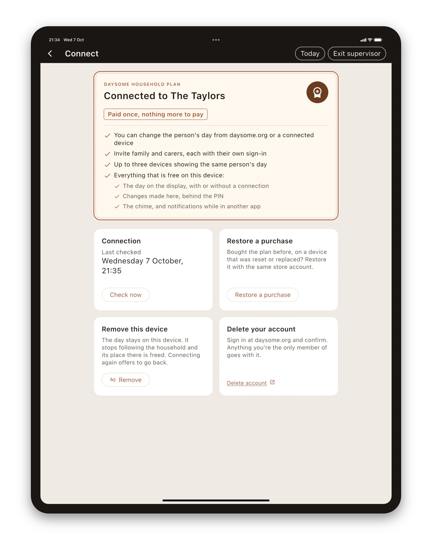
The rest was the kind of thing nobody writes down until it happens to them. Apple had quietly changed which iPhone size it requires, so a full set was refused and a new one had to be taken on a different simulator. One picture caught Apple’s first-boot banner, “Ready for Apple Intelligence”, in the corner. The Android emulators could not reach our test server at all, because the Mac finds it through a local setting the emulators do not read, and they had to be given the same one. And the tablet’s status bar came out in the app’s own cream, which fooled the cropping into trimming the top and bottom of the day.
The build broke three times
The billing library brought something we did not want. Google asks whether an app uses the advertising identifier, and our honest answer has always been no. But the library we use for purchases on Android carries Google’s advertising identifier code with it, even though it only reads it if asked, and we never ask. We left that part out of the build, so the answer is no by construction rather than by promise. The first release build then failed, because the tool that shrinks Android builds stops when code refers to something that is not there. A one-line instruction tells it that the absence is deliberate.
Our own safety check stopped us twice. Fire tablets cannot run Google’s services, so a check in our pipeline refuses any build that depends on them. It works by searching the project for their name, and it found it in the very lines that remove the advertising code. A line that takes a dependency away is now allowed. We should have run that check before tagging the build, not after, and we do now.
A button wrapped on a phone. On an Android phone, “Connect this device” broke onto two lines with its words pressed against the rounded ends. The buttons had been borrowing their lettering from the display’s own “NOW” heading, which is spaced out for reading across a room. That spacing was invisible on an iPad and too wide on a phone. The buttons have their own, standard lettering now, and look much more professional for it. That made three versions in a day, 0.5.0 to 0.5.2, and 0.5.2 is the one in review.
One rule we did not know
The last thing to stop us was Apple’s submission page, which refused to send the app for review: “New subscription groups must be submitted with an auto-renewable subscription from within that group.” We had added the subscription’s group, the folder it lives in, but not the subscription itself. Adding the yearly plan fixed it. It is a reasonable rule, plainly worded, and we had never met it, because this is the first time we have sold a subscription.
Where it stands
Daysome 0.5.2 is in review on the App Store, Google Play and the Amazon Appstore: the first release with the household plan. Everything that was free stays free, and nothing on her display changes whether a tablet is on a trial, a plan, or neither.
Most of what we learned is true of any app that takes its first payment, so we have written it up separately for the next one. The short version is that a store review is a consistency check. The app, the listing, the privacy policy, the questionnaires and the review notes all have to tell the same story, and the moment an app holds an account and takes money, there are a great many more places for that story to drift.
Getting it, and telling us where we went wrong
The free app is out on all three stores: the App Store, Google Play, and the Amazon Appstore, with links to each at daysome.org. The household plan arrives with this release, once it clears review, and starts with a free trial.
We would like to hear from you, and that matters to us more than an install does. If you support someone in the early stages of dementia who is still living independently, or you work in dementia care and would be willing to tell us plainly where we have got it wrong, that is the thing we cannot get any other way. If you would try a test build, say so at daysome.org/testers.html.
Plainly, so nobody is misled: Daysome is an app centred on a display that shows the day. It is not a medical device, not a monitoring system, and not a substitute for anybody. It does not track whether medication has been taken, and it never will.