This is the first part of a build-in-public series about an app we have been thinking about for a year or more, finally started work on, and are still building. It is called Daysome, although the icon reads My Day. It shows one person, on one iPad, what day it is, what is happening now, what is coming next, and what is for tea. That is the whole thing.
We are writing this up as we go rather than after the fact, partly because the interesting decisions are the ones that get forgotten once a product looks finished, and partly because we are looking for a small number of families and care professionals to test it on real hardware. If that might be you, there is a note at the end.
Daysome - a calm iPad display for someone living with dementia
TL;DR – Part one covers the first few days: where the idea came from, why we chose the stack we did, how the requirements arrived, one small development tool that saved more time than anything else we built, and the point at which we put it under version control and pointed it at TestFlight, Apple's app testing system for the App Store.
Contents
- Daysome - a calm iPad display for someone living with dementia
- We were going to build something else entirely
- It is not a reminder app. It is a day clock.
- Why Flutter — and why that is a modernisation decision, not a framework preference
- Designing for eyes several decades older than the designer’s
- The rule we wrote before we wrote any code
- Requirements do not arrive in a document
- Real data broke our assumptions inside five minutes
- The time machine: developing an app that only makes sense at four o’clock
- Show and tell, every few minutes
- What we deliberately did not build
- Supervisor mode, borrowed from a supermarket till
- Making it survive a power cut
- Git, Gitea, and the road to TestFlight
- Where it stands, and what part two will cover
- We are looking for feedback
- Getting it
- What part two covers
We were going to build something else entirely
The session that produced this app started with a different question. We have built UK motoring and civic utility apps — we have a DVLA reporting tool in alpha, a Porsche owners’ club platform in production — and the conversation began as a straightforward “what should the next one be?”. We had a shortlist: an MOT and tax reminder built on the DVSA history API, a fuel price app using the CMA open data scheme, a classic car restoration logbook.
All three were reasonable. None of them made the cut, because the actual answer was already in the room: an iPad display for a family member in the early stages of dementia, who is otherwise happy and settled at home, but who is starting to forget things like when to eat, to drink, and to take her pills — and who reaches for her iPad all day long.
That is a much better idea for an app than anything else on the shortlist, and it is worth saying why: the hardware is already there, already familiar, already trusted, and already switched on. Most assistive technology fails at exactly that step.
It is not a reminder app. It is a day clock.
The first genuinely useful thing we did was to think about and then refuse the obvious framing. this is especially difficult if you have spent much of your career working on personal information managers, groupware, email and calendaring and scheduling software as they emerged and then went on to rule the world.
“Reminder app” leads you somewhere specific and just seems wrong: notifications, checkboxes, streaks, a nagging escalation and buzzers and alerts when something is missed. There is an established product category that leads somewhere better — the dementia day clock, a physical device that displays TUESDAY MORNING in very large letters and sells for sixty to a hundred pounds. It sells because losing track of the day and the part of the day is one of the earliest and most distressing symptoms, and because answering that question continuously, without being asked, is genuinely calming.
So Daysome is a day clock with a schedule attached, and the design principle that falls out of that reframe is the one everything else hangs off:
The display must be completely useful to someone who never touches it. Not “works best without interaction”. Completely useful. Because the days it matters most are precisely the days she will not be interacting with anything.
Why Flutter — and why that is a modernisation decision, not a framework preference
We came to Flutter the hard way. Our app platform for education and healthcare for a client was built on Appcelerator, an early and promising technology for cross platform app development. We had tens of thousands of users on hundreds of apps. Appcelerator was, however, like a Video Tape compared to a Blu-Ray and was at the end of its life. Flutter arrived in 2018 and we were at the launch, and quickly adopted it for that education and healthcare platform. It was fast but not fully formed back then but we could see the promise and over time Flutter has become a well established framework for building mobile apps for the App Store and Google Play.
Our current platform has a managed build system. The source code control is in our own hosted git system using gitea, with smoke-tests on commits, and Fastlane for building for iOS and Android. Developers can build locally for the simulators but sending to production is only possible from the release actions from the repository. We've built a chassis for mobile app modernisation, which is a service we offer to clients, and that chassis delivers feature-first layout, Riverpod for state, GoRouter for routing, very_good_analysis with zero warnings enforced, a smoke-test tier, Fastlane, and self-hosted CI on our own Mac based action runner because you have to use a Mac to build for iOS.
That chassis is why this app existed in a runnable state within a few hours rather than a few weeks. The value of our modernisation platform is not that the new code is prettier. It is that the marginal cost of the next app collapses. Concretely, on day one we had:
- a new project with the house lint rules, analysis clean from the first commit;
- the smoke-test harness copied across and passing;
- the same architecture the team already reads fluently;
- app models hand-written and ready to deploy.
There are three more specific reasons Flutter earned its place here.
Layout that can be tested on many device sizes in under a second. This app has an unusual and brutal constraint: nothing scrolls and nothing is ever truncated with an ellipsis. Every word it is asked to show has to physically fit on the glass. In Flutter we can render the whole display at an 11″ iPad and an iPad mini, in both orientations, inside a widget test, and assert that no overflow occurred. That test suite caught real layout failures repeatedly and there is more on that below.
Typography we control completely. We deliberately do not use google_fonts, because it fetches faces over the network at first use, and a font that arrives late is a blank screen in front of someone who needs it. The platform face is used instead. That is a decision you can only make confidently if you know exactly what your framework does at runtime.
Honesty about the risk. The one place Flutter might yet bite us is Apple’s Assistive Access, which is the iOS/iPadOS mode for people with cognitive disabilities, which strips the device back to enormous targets and a curated set of apps. We have opted in via UISupportsFullScreenInAssistiveAccess in the Info.plist, but Apple’s API is SwiftUI-shaped and Flutter renders into a plain view controller. We have not yet confirmed the full-screen presentation on a real device. It is written into the project documentation as unverified, and it is one of the first things a build in TestFlight is for.
Supporting Assistive Access properly matters more than compliance. It persists across reboots, where Guided Access does not — so it solves the “how do we keep this iPad on one screen after a power cut” problem outright. And an app that works well in normal mode and is first-class in Assistive Access grows with the progression of the condition instead of being outlived by it.
Designing for eyes several decades older than the designer’s
The standard accessibility instincts are subtly wrong for this audience, and this was one of the more interesting research passes of the week.
- Warm, never stark. The ageing lens yellows and scatters light, so a pure white ground glares. Everything sits on a warm off-white.
- Nothing meaningful is ever blue or violet. Blue perception degrades most with age. A status told in blue is a status not told.
- There is no red in the palette at all. Not as a style choice — as a rule, enforced to the point that the framework’s own error colour is remapped to our accent so a stray error state cannot paint an alarm colour onto her screen.
- No italics, no all-caps, no font weights above semibold. Very heavy faces close up the counters inside letterforms and read worse at large sizes, not better.
Contrast ratios are measured rather than assumed: 17.1:1 for primary text, 7.2:1 for secondary, 5.3:1 for the accent, all on the warm ground.
The rule we wrote before we wrote any code
Nothing on her screen ever reports a failure.
No red, no “missed”, no “overdue”, no items struck through. When something’s time has passed it simply drops off the display, exactly as if it had never been there. Missed items are information for the carer’s phone, and only for the carer’s phone.
This is not softness. We think that a screen that tells someone with dementia that they have failed creates anxiety in someone who was otherwise settled, and buys back nothing at all, because the information was never actionable in the first place. There is a test in the suite whose only job is to assert that the words “missed” and “overdue” never appear on the display, and another that asserts the display contains no buttons or text fields whatsoever.
Tests here that act as a guard rail for product decisions, rather than just for logic, turned out to be one of the more valuable habits of the week.
Requirements do not arrive in a document
They arrive one message at a time, usually while you are still building the last one, and each one quietly invalidates an assumption.
The working loop was: build, build to the simulator, screenshot, look at it together, react. Over a couple of days that loop produced, in order:
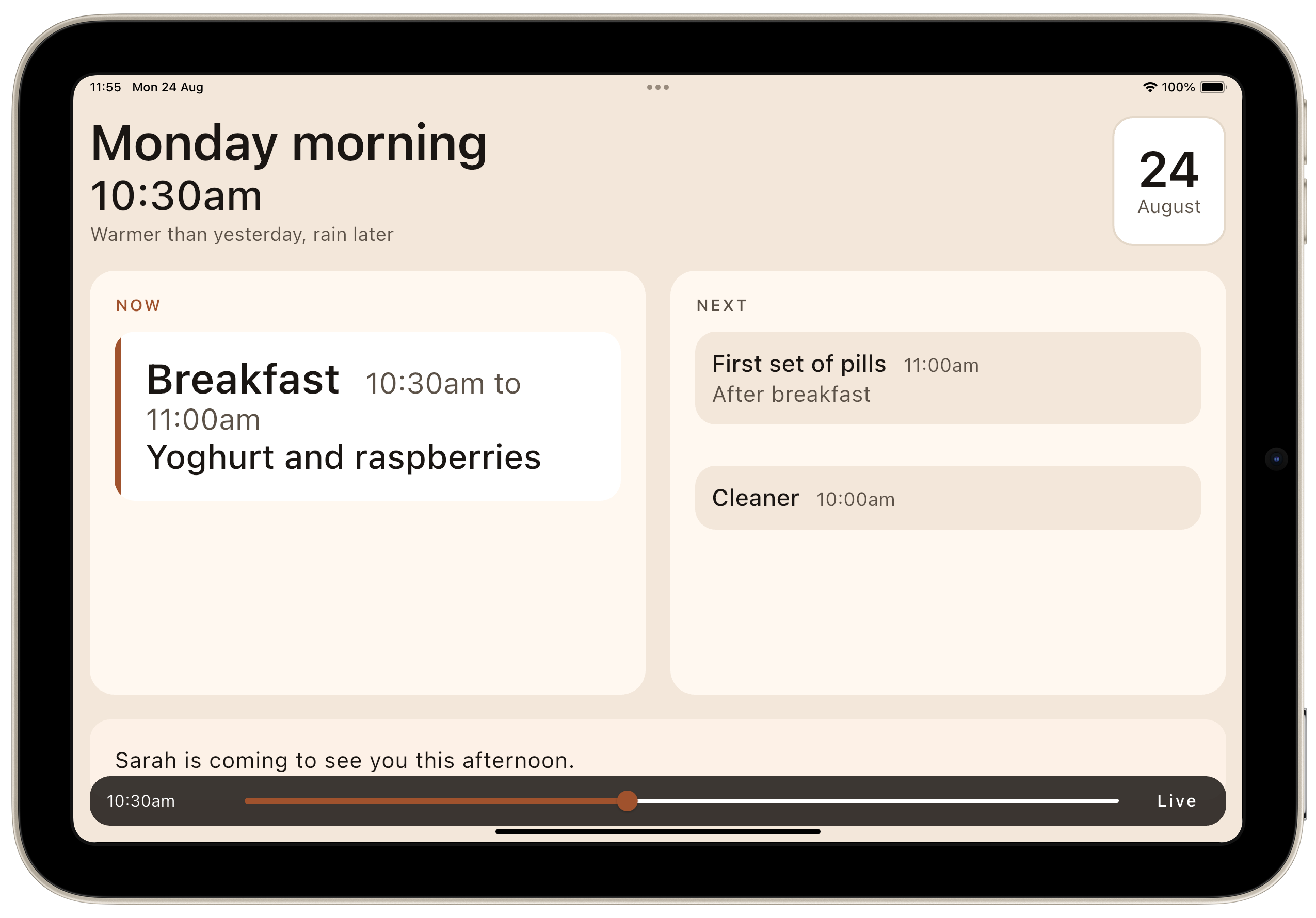
- “The clock needs to be bigger — it’s what tells you whether something is now or next.” It had been a footnote next to the date. That was a misjudgement, and it now has its own line at nearly headline size.
- “I don’t see the now/next pattern — perhaps it needs to show both.” The display had been showing NOW or NEXT. Now it always shows both, in slots that never move.
- “It shouldn't check that anything has been done.” We built a Done button, tried it out, decided it was pointless. Then we took it out again — see below.
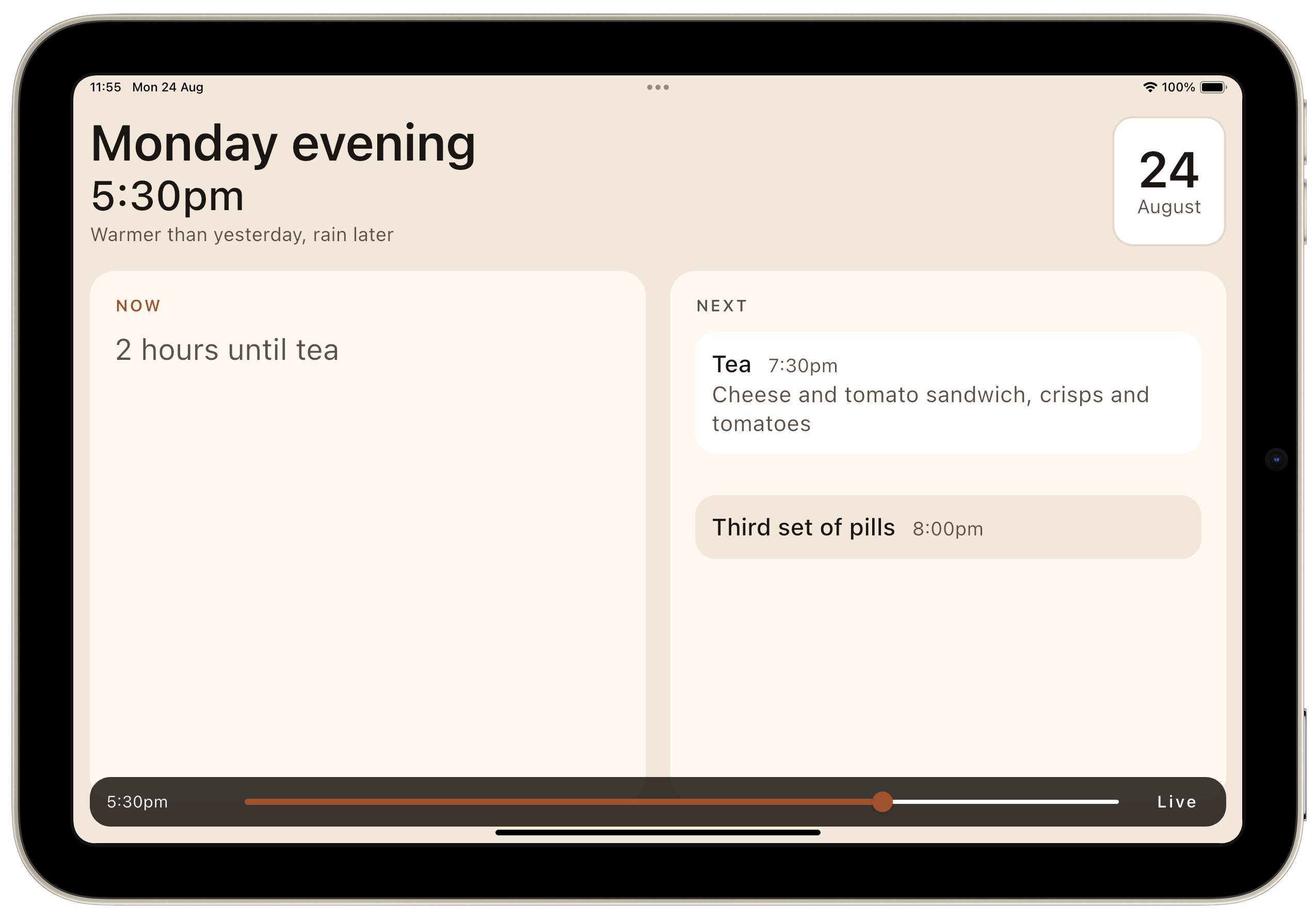
- “When there’s a gap, nothing indicates there’s space.” Between events the display had been promoting the next thing into the empty slot, which quietly implied that tea was imminent at half past five, and lost the fact that she has two free hours.
- “I don’t like ‘Free time’ — too prescriptive.” Correct. Naming the gap is the display having an opinion about how she spends her own afternoon. It now says “Half an hour until Tea” and nothing else.
- “Use quarter of an hour, half an hour, less than half an hour.” Also correct. “Half an hour” is a quantity of time a person feels; “34 minutes” is a number you have to convert into one first.
Not one of those was in the original brief. All of them are now product rules with the reasoning recorded, because the reasoning is the part that gets lost.
Real data broke our assumptions inside five minutes
Then came a real household’s routine and meal plan, shared by the family. It broke four things immediately, and that is exactly what real data is for.
- A day is not three meals. This household wakes at eight, gets up at quarter to ten, has coffee at 10:15, breakfast at half ten, lunch at one, a drink at four, and tea at half seven, with a set of pills after each meal from one box with compartments. Meals are late by most people’s reckoning, and the evening meal is a sandwich.
- “Dinner” is called “Tea”. So there needed to be no assumption that there are three meals a day. A household’s meals are simply the items it has marked as meals, named however the family names them. The internal identifier and the family’s word are deliberately different strings.
- Our character limit was too short. We had capped item labels at 24 characters, derived from where text stops fitting. The very first real routine contained “Get up, dressed and washed” — 26 characters. We raised the cap to 28 rather than shortening the household’s own words, because trimming a family’s language to fit our layout is the wrong way round.
Weekly events are what give a week its shape. A cleaner on Monday, help with a shower on Tuesday, a shopping delivery on Thursday. Adding those exposed a real bug: all three overlap the late-morning routine, and because only one thing can hold the “now” slot, the cleaner was vanishing off the display for the entire hour she was actually in the house. That would have happened every Monday, Tuesday and Thursday from day one.
The time machine: developing an app that only makes sense at four o’clock
This is the part we would most like other developers to steal.
Daysome is an app whose entire output is a function of the current time. At half ten it shows breakfast; at four it shows an afternoon drink; at eleven at night it shows bedtime. The layout changes shape between those states: the focus card grows and shrinks, the schedule shortens as the day goes on, the note comes down when its part of the day is over.
Which raises an awkward practical problem: how do you look at the eight o’clock state at two in the afternoon?
The naive answers are all bad.
- Change the device clock — slow, and it breaks other things.
- Write a fixture and inspect it in a test — fine for logic, useless for judging typography.
- Wait until eight o’clock — not a development process.
What we built instead took about forty lines: a debug-only time scrubber pinned to the bottom of the display. Drag it and the whole app re-renders at that time of day. Tap “Live” and it snaps back to the real clock.
final timeOverrideProvider = StateProvider<int?>((ref) => null);

final nowProvider = Provider<DateTime>((ref) {
  final base = ref.watch(clockProvider).value ?? DateTime.now();
  final override = ref.watch(timeOverrideProvider);
  if (override == null) return base;
  return DateTime(base.year, base.month, base.day)
      .add(Duration(minutes: override));
});
Everything that needs “now” reads nowProvider rather than the system clock, so the override lands everywhere at once. The widget is wrapped in kDebugMode, so it is compiled out of release builds entirely — which matters enormously here, because a slider that moved her day would be the single worst thing we could possibly put in front of her.
The payoff was larger than expected, and it was as much a product management tool for me as a developer one:
- Reviewing a whole day of states takes about fifteen seconds instead of a day.
- Stakeholder review stops being hypothetical. “Here is what she sees at breakfast, here is lunchtime, here is bedtime” — dragged live, in one conversation.
- It surfaced design problems we would otherwise have shipped. The “gap between events” issue was found by scrubbing, not by reasoning — you have to see the empty state at half five to notice that it is lying to you.
If you are building anything whose display depends on the time or on events — a schedule, a rota, an opening-hours widget, a match-day app, a countdown — build the scrubber first. It is an afternoon’s work and it pays for itself the same day.
Show and tell, every few minutes
The other half of the loop was a build script that builds to an iPad simulator, installs, launches, and screenshots in one command. Every design decision in this article was made by looking at a picture, not by reading a description.
One small decision worth passing on: the script defaults to an iPad mini, not to the large iPad the type scale was drawn against. The mini is the tightest screen we support — ninety points shorter in landscape — and since everything has to physically fit with no scrolling and no ellipsis, the sensible default is the device that runs out of room first. If it fits on a mini it fits with room to spare on anything larger.
| Device | Usable height, landscape | Role |
|---|---|---|
| iPad mini | 664 pt | Development default — the tightest case |
| iPad Pro 11″ | 754 pt | What the type scale was drawn against |
Rather than size everything for the smallest screen and leave the largest looking timid, the type scale follows the glass: it shrinks on shorter screens, never grows, bottoms out well short of unreadable, and composes with whatever text size the person has set system-wide instead of overriding it.
What we deliberately did not build
The negative space in this product is doing as much work as the features.
No Done button. We built one. It lasted about an hour. The family’s existing habit is a paper chart with a green tick or a red cross, marked by whoever visited — but that is a carer’s artefact, and it does not transplant. A red cross on her screen breaks the first rule outright. Her tapping is unreliable in both directions, so the signal is noise wearing the costume of data — and a false “taken” is considerably worse than no signal at all. It was also the only tappable thing on a display whose entire premise is that there is nothing to tap. When it does return it will be on the carer’s side, worded as what it actually is: “marked done at 10:52”, never “taken”.
No medication detail, ever. No dose, no drug name, no strength, no clinical instruction. A bare line item with a time is a personal organiser; the moment it carries dosing information it drifts toward being a regulated medical device under the UK MDR, and it stops being safe. The pill box remains the only thing that knows what has actually been taken. The app points at it and no more.
No food ordering or stock management. Tempting, adjacent, but a different product. Building it here would turn a calm display into an inventory terminal.
No ads. No streaks. No scores. None of which would mean anything to her, and all of which would turn a day into something that can be failed.
Supervisor mode, borrowed from a supermarket till
The carer still needs a way in — principally because many meals are ready meals, and whoever is there checks what is actually in the fridge and in date and swaps today’s choice for another off the household’s list.
We modelled it on a supervisor override on a point-of-sale terminal: some taps in a corner that carries no visible affordance, then a PIN. Behind it is the whole day, top to bottom, with every line editable — times, labels, how often something happens, the note of the day, and the household’s menu list.
Two rules hold it together. It looks nothing like her display — dark app bar where hers is warm cream, ordinary type sizes, ordinary controls, and a list that scrolls — so that nobody glancing at the iPad from across the room can mistake one for the other. And it puts itself away after thirty seconds without a touch, because a carer called away mid-change must not leave her iPad sitting on a settings screen she has no way to understand or escape.
That timeout produced our favourite small bug of the week: opening a time picker paused the app’s own interaction tracking, so a carer standing there deciding whether tea is at half six or seven would have supervisor mode close underneath them mid-decision. Every dialog now suspends the idle timer and restarts it afterwards.
Making it survive a power cut
An iPad in somebody’s house will lose power. If it comes back holding our sample data instead of the routine a carer spent twenty minutes entering, the app has done real harm: she reads a day that is not hers, and nobody in the family necessarily notices.
So the whole household — PIN, routine, menu library, today’s meal choices, today’s note — is written to storage as a single JSON blob, read before the first frame so the display paints a full day immediately. An asynchronous load would mean a blank screen on every launch, which is precisely the moment after a power cut when she is most likely to be looking at it.
A corrupt snapshot returns nothing rather than throwing. Falling back to the sample is a poor day; failing to start is a blank screen.
And there is no default PIN. The first person into supervisor mode is asked to choose one, entered twice, rather than to guess one — because a shipped default means every iPad in the field opens with the same four digits. Entering it twice is not ceremony: a PIN mistyped once and then relied upon locks a family out of their own iPad, and the person it belongs to cannot help them.
Git, Gitea, and the road to TestFlight
With the app at the point where it could be left running in a house, we put it under version control and wired up the entire pipeline. The split we have settled on across the estate, and which we have carried into this project:
| Build | Where it runs | Why |
|---|---|---|
| Simulator | Local, one script | No secrets, no certificates, no runner. Waiting on CI to look at a layout is a poor way to spend an afternoon. |
| TestFlight and Play Store Internal Test track | Gitea Actions, on a v1.2.3-beta1 tag |
Needs signing material that should live in exactly one place |
| App Store and Play Store | Gitea Actions, on a v1.2.3 tag |
Same, plus an audit gate |
The runner is one of our own Mac computers, managed through Homebrew, with Fastlane match pulling certificates from a per-app encrypted git repository. Two details carried over from previous apps that are worth knowing if you run a similar setup:
Pin the signing certificate by SHA-1, not by name. We have several distribution certificates sharing the name “Apple Distribution: Multizone Limited” — one per app — so a name-only match lets Xcode pick whichever surfaces first in the keychain. That is how you end up signing one app with another app’s certificate. Pin it at both the archive and export phases; they are configured separately.
Derive the build number from the wall clock. Ours is a floor plus UTC-minutes-since-epoch. A commit-count scheme collides the moment a local upload and a CI tag-deploy run from the same commit, and the store rejects the duplicate.
Everything ships behind a pre-release audit script — analyze, smoke tests, full suite — that CI runs before it will build anything for a store.
Where it stands, and what part two will cover
At the end of part one the display is real: day part and clock, now and next in fixed slots, described gaps, meals with menus, weekly events, a note that takes itself down, supervisor mode with full editing, and a household that survives a reboot. Analysis is clean, the test suite is green, and it runs.
Still to come, and the subject of the next few parts:
- Real hardware. Assistive Access is still unverified from a Flutter host, and the typography has only ever been judged on a simulator.
- Local notifications. She uses other apps, so the display cannot always be the thing that reaches her.
- A home screen widget, which for someone drifting between apps may end up more important than the app itself.
- The backend. Not because the data is large — it is tiny — but because of the people. A daughter updating the plan from her own phone is what forces a server, and edits stranded on one iPad help nobody.
- The carer side of the app and the subscription model.
We are looking for feedback
We are particularly interested in hearing from:
- families supporting someone in the early stages of dementia who is still living independently at home;
- occupational therapists, dementia advisers and care professionals who would be willing to tell us where we have got it wrong;
- anyone who has bought one of those physical day clocks and can tell us what it does and does not solve.
What it is, plainly: a display that shows the day. What it is not: a medical device, a monitoring system, or a substitute for anybody. It does not track medication adherence, and it never will.
Getting it
Daysome is available now and is designed for tablets but also works on phones:



What part two covers
Building for One, Part two: what it costs to buy one command covers the challenges in getting the build environment right, to the point of audit, building of both platforms, and delivery to TestFlight and Google Play internal testing so that we can run on real tablets and phones.