Building for One, Part one: a calm iPad display for someone living with dementia built a calm daily tablet display for someone in the early stages of dementia. Building for One, Part eleven: two days between finished and in review took the household plan to three stores’ reviewers, and Building for One, Part twelve: Joomla as the household’s front door built the website the family uses while the app waited. This part is about what happened when Apple said no.
Google and Amazon approved the release in a day. Apple turned it down, for a reason that was wrong and a problem that was real. A week later we sent it back, and the app it went back as is better than the one that was rejected.
TL;DR – A reviewer who can’t find their way into an app is a usability test, and we had failed it. Fixing that for the reviewer fixed it for every family who installs Daysome. App Store Connect then took more hours than the fix did.
Contents
“Launched on a frozen screen”
The rejection came on 9 October, from a reviewer using an iPad Air on iPadOS 27. The app had launched on a frozen screen, it said.
It hadn’t frozen. Daysome’s display ignores touch on purpose, because the person it’s for should never be able to change it by accident. The settings sit behind five taps in the top-right corner and a PIN, and the corner is invisible, because anything that looked tappable would be something for the person to wonder about. The review notes explained all of this. We replied to say so.
Then we thought about who else opens the app for the first time. A daughter who has just downloaded Daysome for her dad’s iPad is in exactly the reviewer’s position. She sees a calm screen showing a made-up family’s day, she taps it, and nothing happens. The way in was written down in a store note she will never read. The reviewer was wrong about the cause and right about the experience, so we decided to fix it in the app rather than argue about it.
A welcome page, for as long as nobody has chosen a PIN
There’s no default PIN in Daysome, deliberately: the first person into the settings is asked to choose one. So “no PIN yet” means exactly “nobody has set this tablet up”, and that is when the app now opens on a welcome page instead of the day. Every tablet already in use has a PIN and never sees it. Once a family has been in, it never covers the display again.
The page is four cards. See an example shows a made-up household’s day. Use it on this device only has a drawing of the screen with the corner marked, the sentence “Tap five times in the top-right corner, within five seconds”, and a Set it up button that goes straight to choosing the PIN. Create an account is for the household plan, and Add this device to an existing Daysome household is for a family that already has one. The page teaches the five taps rather than replacing them, so the person setting up learns the way back in the moment they first need it.
The example became a preview. Until now a new install started with the example household’s day, kept until somebody cleared it. That meant twelve made-up items in front of a family trying to set up their own, and, for a family who connected to a household first, the example’s day on the website too. Now a new device starts with an empty day, and the example is something you look at from the welcome page and leave. It also runs through its day by itself, from half seven in the morning to half eleven at night at a quarter of an hour a second, because a still afternoon showed what the display looks like but not what it’s for, which is that it moves on without anybody touching it.
An empty day needed words. With nothing planned, the display said “Nothing else planned today” twice, once where the current thing would be and once where the next thing would be. It says “Nothing planned today” once now.
An account from the tablet
Part twelve made daysome.org somewhere a family could sign up. The app still sent them there with a code to carry across. Now the welcome page can start an account itself: enter an email address, follow the link that arrives, choose a name and password on the page it opens, and the tablet connects on its own. The step that says “check your email” ticks itself when it does.
The page never says whether the address already had an account, because that would tell anybody who typed an address whether its owner uses Daysome. Somebody with an account is asked to sign in instead, and the words say that this can happen.
Our first test email promised a code nobody could see. The sign-up page and its email said the device asking for the account was “showing the code EYY8GK”. It wasn’t: the tablet doesn’t show a code on this route, because there’s nothing to type. The words were left over from an earlier design, and we only found them by going through the sign-up as a family would. Both are gone, in AppSync 0.1.28. While that was going on, daysome.org updated itself to Joomla 6.2 underneath us, and nothing noticed.
The settings, regrouped
Behind the PIN, the settings had grown one row at a time. The first item was “Today”, which turned out to be the display again with edit buttons on it, and it read as a second way out. It has gone. The note of the day is now the first row, today’s meals are the first day of Meals for the week, and something for one day only goes in the routine.
The rest is three groups and a reset: The day (the note, the weekly routine, meals for the week, the meal lists, and special days), The display (the weather, keeping the screen on, and the sound), This device (the household, changing the PIN, and About), and Reset. Above them all is a card repeating the welcome page’s five-taps drawing, because the settings close themselves after half a minute untouched, and the corner is easy to forget between visits.
An empty routine suggests. With no example to start from, a new household’s routine page offers the ordinary things most days have: get up, breakfast, coffee, lunch, an afternoon drink, tea, bed, the cleaner coming. One tap opens each in the editor, filled in, to change to suit. A short meal list does the same with dishes, by what the meal is called. None of the suggestions is medicine, by rule.
The pages one level down haven’t caught up. The grouped menu looks considered and the pages it leads to look like they did before. That’s the next piece of work.
The screenshots found a bug
Every store wants new screenshots when the app changes this much, and ours are taken by script. One of them, the iPad showing a plan that has been paid for, came back showing a free trial with prices in US dollars. Our server had recorded the purchase. The app hadn’t asked.
The cause was small and real. To save the server from hundreds of tablets asking it the same question every minute, each tablet checks a small static file that changes when anything in its household does. The first time a tablet read that file, it took what it found as the starting point, so anything that had already changed, including a purchase made a moment before, didn’t count as a change. A plan bought on the website or another tablet just before a tablet started would not have shown on that tablet straight away. The first reading counts as a change now, there’s a test that fails without the fix, and the retaken screenshot says “Paid once”.
Xcode 27 moved the furniture. There’s no Simulator app any more. Simulators live in a new app called Device Hub, which shows whichever device is selected in its sidebar, and the keyboard shortcut that rotates a simulator rotates that one. The first time our script tried to turn the 13″ iPad into landscape, it turned the iPad mini we use for development instead. Screenshots now also come out the way up the device is, which earlier versions didn’t, so the script’s old habit of turning every picture a quarter turn put the new ones on their side. The script now selects the device by name first, and turns it until a test capture has the right shape.
Android had its own surprise: a release build now opens on the welcome page, which is correct and no use for a picture of the day. The Android screenshots are taken from a build told it is taking screenshots, as the iOS ones already were.
Writing for a reviewer
The review notes were rewritten from scratch, around the route a reviewer actually takes. They lead with the account to use on daysome.org, then four steps on one iPad: show the code on the welcome page and copy it, open daysome.org, sign in and add the device to the review household, and come back to find the household connected, on its trial, with both purchases underneath. Only then does it say how to reach the settings.
Words Apple doesn’t like. The account is the “App Review account”. Apple has turned down builds for showing words like beta, and we have read that demo and test count against you in review notes too, as words for things that aren’t the real product. It’s a real account on the real site, so calling it what it’s for is also simply true.
Writing the notes found two things. Our first draft told the reviewer the app would ask whether to keep the tablet’s day or the household’s. It doesn’t on a fresh install, because there’s nothing on the tablet to keep, so the household’s day just arrives. We only noticed by checking every sentence against the code. And while writing a note for each purchase, we found the reviewer can only ever buy one of them: once either is bought, the offer gives way to the plan and the other button goes. The notes now say so, and how to try the other with a household of their own.
A year that lasts a day. After testing the yearly subscription, the review household said it was paid up to the following day. That looked like a bug and isn’t: TestFlight renews every subscription daily, whatever its length, six times, and then stops. Apple’s sandbox shortens it in its own way too. The date comes from the store, and the store was telling the truth about a test. It does mean the review household has to be put back on its trial before every submission, or the next reviewer finds a plan that ran out a week ago.
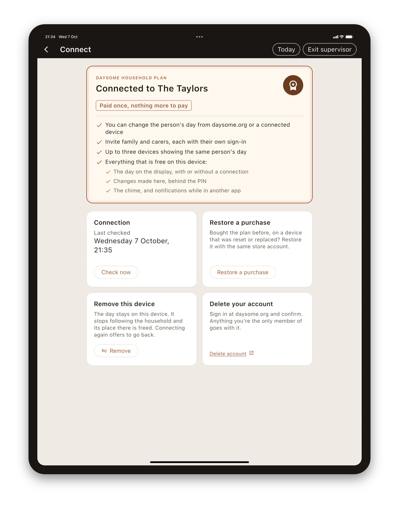
App Store Connect
The fixes took a few days. Getting them back in front of a reviewer took a few hours of clicking, and most of that was App Store Connect.
The purchases were locked. Both in-app purchases had gone in with the rejected build, and they were still sitting in its submission, marked ready for review. In that state nothing about them can be edited: not the note to the reviewer, not the screenshot that shows the purchase. To change them, each had to be removed from the submission first. Removing is not deleting, and the difference matters: a deleted product’s identifier can never be used again, and our server, RevenueCat and the other two stores all know the products by those identifiers.
Then they had to go back in together. A first in-app purchase can only be reviewed alongside a version of the app, and a subscription has to go in itself, not only the group it belongs to. So the version, the subscription and the one-time purchase have to be gathered into one submission, each from a different page, before anything can be sent.
Every field is a box. The release notes, the review notes and each purchase’s notes are plain text boxes, each with its own limit and its own save button, on pages a few clicks apart. Our copy lives in one document where it can be checked against the app, so every change meant pasting into several boxes and checking each one had saved.
Then it was turned down again, for a picture. The resubmission came back the same day, under a different guideline: accurate metadata. Each purchase has a box for a promotional image, the square picture the App Store uses if a purchase is promoted on the app’s own page, where someone can buy it before they’ve installed anything. We had put the app’s icon in both, so each picture was the same as the icon and the same as the other, and the guideline allows neither. We don’t promote the purchases, and can’t yet: the plan belongs to a household, and somebody buying from the App Store page before installing has no household for it to belong to. The rejection itself offered the fix, which was to delete the pictures if there were no plans to promote, so we did and sent it back. Promoting the purchases properly, with a picture of each and somewhere for the purchase to wait until there’s a household, is on the list for later.
We think App Store Connect feels more like a company’s internal tool than one of its products. Everything is possible and nothing is helped. It’s a surprise from a company whose whole reputation is for the opposite, and it isn’t a small cost for a small developer: a few hours here is a few hours not spent on the app.
Keeping the stores in step
Google Play and the Amazon Appstore have had the household plan since 0.5.2. Everything Apple’s rejection gave us, the welcome page, accounts from the tablet, the regrouped settings, is just as good on Android, so we sent 0.6.2 to both the same day it went back to Apple. We would rather a family gets the same app whichever tablet they have.
It also showed us what to automate next. Every tagged build already goes to TestFlight and Play’s internal track by itself. Promoting it to production, filling in the release notes, the review notes and each purchase’s notes, and gathering the purchases into one submission are all still done by hand, and every one of them can be done through the stores’ own interfaces for programs. Amazon is the exception: its interface for programs doesn’t take the kind of build we upload, so that one stays scripted rather than automated. Those are on the list for the next release, alongside the pages one level down in the settings.
Where it stands
0.6.2 is back with Apple’s reviewers, without the pictures, with both purchases, a welcome page that explains the five taps, and notes written for the route a reviewer actually takes. It’s on its way to Google Play and the Amazon Appstore at the same time.
The lesson we would pass on is the one at the top. When a reviewer gets something wrong about your app, it’s worth asking who else would get it wrong the same way. Ours was a family setting up a tablet for somebody they love, which is the one person we most need to get it right for. The rejection cost us a week, and paid for itself in that first five minutes.
Getting it, and telling us where we went wrong
The free app is out on all three stores: the App Store, Google Play, and the Amazon Appstore, with links to each at daysome.org. The household plan is on Google Play and Amazon now, and arrives on the App Store with the release in review. It starts with a free trial.
We would like to hear from you, and that matters to us more than an install does. If you support someone in the early stages of dementia who is still living independently, or you work in dementia care and would be willing to tell us plainly where we have got it wrong, that is the thing we cannot get any other way. If you would try a test build, say so at daysome.org/testers.html.
Plainly, so nobody is misled: Daysome is an app centred on a display that shows the day. It is not a medical device, not a monitoring system, and not a substitute for anybody. It does not track whether medication has been taken, and it never will.