Building for One, Part one: a calm iPad display for someone living with dementia built a calm daily display for someone in the early stages of dementia. Building for One, Part two: what it costs to buy one command spent two days turning it into one command that ships to both stores. This part is about the afternoon it finally ran on a real iPad, and how much of the design turned out to be wrong.
Not broken, just wrong in the way things are wrong when you have only ever seen them on a desktop display.
TL;DR – A simulator tells you whether something fits. Only a device tells you whether it reads. And only a person tells you whether any of it was the right idea.
Contents
- The first thing we found was that it goes to sleep
- She holds it. That changes the brief.
- She does not know what the symbols mean
- The weather, without a weather app
- An open book, made of tone rather than lines
- A box round nothing is still a box round nothing
- It is not a calendar, and that changes every line
- One card, learned once
- iPad screenshot
- Two Flutter details worth stealing
- The shedding ladder
- How much of this came from being told
- Still open
- Getting it
The first thing we found was that it goes to sleep
The build went onto an iPad mini — deliberately, because it is the same screen size as the first person who will use it. Within about two minutes it became obvious that the whole thing was pointless, because iPadOS dimmed the screen and turned it off.
wakelock_plus had been in the dependency list since the first commit. It had never been wired up. Every design decision in the previous two parts assumed a display that was visible; the display slept on the usual timeout like any other app.
A day clock that goes dark after two minutes is not a day clock. It is on by default now, with a switch behind the carer's PIN, because it only really makes sense with the iPad plugged in and not every household will want that.
This is the most ordinary kind of bug and the most instructive. Nothing about it was visible in code review, in tests, or in a simulator, because a simulator never sleeps. It took thirty seconds of a real device sitting on a real table.
She holds it. That changes the brief.
The plan had always assumed an iPad on a stand, read from across a room. Most of the typography decisions came from that assumption: very large type, aggressive shedding of content to protect the headline, a layout designed to be legible at two or three metres.
She does not use a stand. She keeps it plugged in and holds it, most of the time, seemingly all the time!
Measured on the mini: the display is just readable at three metres, comfortably readable at one, and read in the hand it is more than adequate — from someone with better eyes than the person it is for. So the type is not the constraint we feared.
But the second-order consequence is bigger than the first. If the iPad is in her hands rather than in her eyeline, the display cannot be the primary channel. She has to pick it up and look, and nothing prompts her to. That moves local notifications from “next on the list” to the thing that makes everything else work: a notification reaches her wherever the iPad is; the display then answers the detail once she has it.
Three days of layout work, and the most important finding was about where the device physically is.
She does not know what the symbols mean
This is the single most useful thing anyone has told us about this product.
The person it is for does not know what the play symbol means. Or mute. Or brightness. A lifetime of interfaces has not taught her, and she will not learn them now.
So there are no icons anywhere on her display. Not a clock, not a knife and fork, not a TV icon, not a chevron. It is a rule with a test behind it, and the reasoning is written down so it does not get designed away later: an icon she cannot read is worse than nothing. It is a thing on the screen that might be important and cannot be checked, which is precisely the anxiety this app exists to avoid.
Supervisor mode — the carer's side, behind a PIN — is exempt. Carers are likely decades younger and a chevron costs them nothing.
It is worth considering how counter-intuitive this is. Every accessibility instinct says pair text with an icon for redundancy. For this audience the icon is not redundancy. It is a an extra thing to fail to understand.
The weather, without a weather app
She asks constantly whether it is cold or warm. So her day is incomplete without that information.
But what she is asking for is not a forecast. A temperature is a figure to be interpreted; the answer she actually wants is what sort of day it is. So the display carries one phrase under the clock:
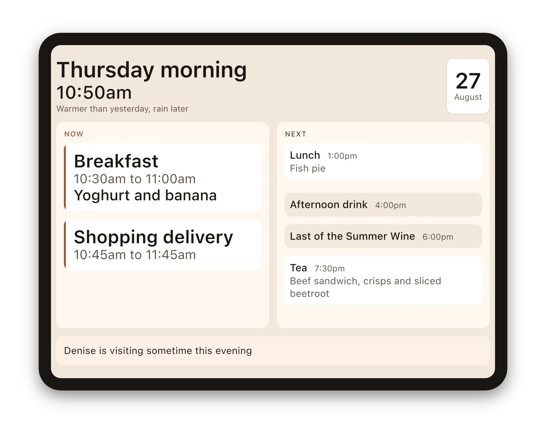
Warmer than yesterday, rain later
No degrees. No percentages. No little cloud. In the code it is deliberately a plain string rather than anything weather-shaped, and when the backend lands it could compose the sentence server-side and send it down finished, but at the moment, with a side benefit of data privacy, this is locally constructed. Phrasing rules are the interesting part and belong in one place. The project documentation says it outright: this must never become a weather app.
It is also the first thing to be dropped when the screen is short, because it is the only line that is pure context with nothing to act on.
An open book, made of tone rather than lines
Landscape needed structure. There is deliberately very little on screen, and with a lot of width the eye wandered across the gap between the two columns instead of down each side.
The first attempt at resolving this was a horizontal rule under the heading and a vertical rule between the columns. It looked wrong, and the reason it was wrong is a decent general principle: the display already used cards to group things, and a rule is a second system saying the same thing in a different way. Two competing visual cues fighting is worse than either alone.
What replaced it: a deeper warm ground, with page-coloured sheets sitting on it. Two side by side in landscape, one in portrait. Nothing is drawn between them — the gutter is the fold. No border, no shadow, no page curl. It reads as an open book without a single skeuomorphic pixel, because the only thing borrowed from a book is the shape of the space.
The heading sits above the pages rather than on the left one. That was not an aesthetic choice: with the heading on the page, NOW started two hundred pixels below NEXT and the two halves of the answer stopped reading as a pair.
A box round nothing is still a box round nothing
Between events the display says how long there is and until what — “Half an hour until Tea”. That block had an outline, to occupy the space where the current activity would otherwise be.
On a page it read as a box inside a box. And the deeper problem was that the gap had no heading at all, while the other half of the display had NEXT: the two halves were built differently for no reason.
This was fixed by moving NOW out of the card and making it a heading on the page, exactly as NEXT is. Now it heads both cases — an event and a wait — and the card is left doing the one job it is good at: marking a thing with a time on it.
That also dissolved an alignment hack. NOW and NEXT had been lined up by insetting the whole right-hand column to compensate for the card's internal padding. With both eyebrows at the top of their own page they line up because they are built the same way, which is a better reason.
It is not a calendar, and that changes every line
The schedule read like this:
4:00pm   Afternoon drink
7:30pm   Tea
Aligned times down a single edge, scannable, tidy. Wrong.
The observation that fixed it: this is a display about what happens each day, not when. That is the whole difference between it and a calendar app, and leading with the time put the least important part of every line first. She does not need to know that something happens at four. She needs to know first that a drink is coming, and only then when it is due.
So everything leads with the thing now — what is happening, what is next, and every row of the schedule.
One nuance that cost us a meal. Stacking the time under the label, as the NOW card does, doubled the height of every schedule row, and the shedding rules promptly dropped tea off the display. Losing the next meal to make room for “4:00pm” on a line of its own is a poor trade. In the list the time trails the label instead; in NOW and NEXT, which are one item each, it can afford its own line.
One card, learned once
By this point the display had three different shapes for what was essentially the same thing: what is happening, what is next, and each line of the schedule, each with its own internal order.
They are one card now. The order never varies: the thing, the time beside it, then what it is underneath.
This is not a tidy-up. Every different shape on this display is something to parse, and parsing is exactly what we are trying to spare her. It also dissolved the remaining alignment problems rather than solving them — nothing needs insetting to line up with anything else, because everything is the same card.
Meals stay distinguishable by fill rather than by shape: raised in white, everything else recessed into the ground tone. Same card, same order, same alignment, different weight. The fixed points of the day still read as fixed points, and there is one pattern to learn instead of three.
iPad screenshot
Two Flutter details worth stealing
Both came out of that unification and both are the kind of thing that looks like a styling problem and is not.
Baselines. Putting the label and the time side by side in a Row with CrossAxisAlignment.baseline, or in a Wrap with WrapCrossAlignment.end, aligns the bottoms of boxes rather than the baselines of the text. With a time half the size of the label beside it, the time sits visibly low in every card. The fix is not to nudge it: it is to make them one run of text.
Text.rich(
  TextSpan(children: [
    TextSpan(text: item.label, style: labelStyle),
    TextSpan(text: '   ${item.displayTime}', style: timeStyle),
  ]),
)
Inline spans share a baseline by construction. They also wrap, which a Row cannot — and that matters, because a headline-sized “Lunch” beside “1:00pm to 1:30pm” needs more width than a page has. Laid out as a row it overflowed by 180 pixels; as text it simply wraps the time onto the next line when it must.
Measure text, do not estimate it. This display has a hard rule that nothing scrolls and nothing is ever truncated, so it has to decide what fits before laying anything out. A note runs from one line to six depending on the width it is given. Estimating that is either wasteful or wrong, and wrong means a striped overflow banner across the screen of someone who cannot be expected to report it.
final painter = TextPainter(
  text: TextSpan(text: note, style: style),
  textDirection: Directionality.of(context),
  textScaler: MediaQuery.textScalerOf(context),
)..layout(maxWidth: width);
Note the textScaler. An earlier version measured from the style's declared font size and under-counted by exactly the amount the display had scaled the type — which meant it got the answer wrong precisely when the type was largest, which is when it matters most.
The shedding ladder
All of this rests on one mechanism that is worth describing on its own, because it is the thing that lets the display be both large and honest.
Nothing on this screen scrolls and nothing is ever ellipsised. So when the content does not fit, something has to go, and the order is fixed and written down:
- the outlook — the only line that is pure context
- the date card — a fact to look up, not a thing to be told
- a meal's menu — knowing there is a lunch beats knowing it is cottage pie
- a row of the schedule
- the note of the day — last, but not exempt
Never the heading. Never what is happening now. Those are what the display is for.
Two thing protect it: the type scales down on shorter screens rather than sizing everything for the smallest device, and below a minimum page height the note is dropped rather than allowed to squeeze the day. A phone is not a target for this display — it is a tablet layout — but there is a test asserting it degrades rather than breaks, which is a good general pattern for a platform you support without designing for.
How much of this came from being told
Build-in-public writing tends to describe design as though it arrived fully formed. Thats never true and is revisionism at best.
Of the changes in this part, almost all began as someone looking at a screenshot and saying that is wrong. The clock being too small. NOW and NEXT not reading as a pair. “Free time” being presumptuous about how she spends her afternoon. The gap having no heading. The list leading with the time. Everything wanting to be one card.
The value of writing it down afterwards is not the decision; it is the reason. A rule without its reasoning looks arbitrary in three months and gets tidied away by whoever is next in the file — which is exactly how a deliberately-removed feature comes back. The project requirements documentation now runs to several hundred lines of product decisions with the argument attached, including a section titled “Why there is no Done button” about a feature that was built and deleted in the same afternoon.
Still open
Assistive Access remained unverified. Apple's iPadOS and iOS mode for cognitive disability strips the device back to enormous targets and a curated set of apps, and it persists across reboots — which would solve “how do we keep this iPad on one screen after a flat battery” outright. The Info.plist key is set. Whether it renders full-screen from a Flutter host rather than letterboxed under the system back button provided by Assistive Access is still, honestly, unknown. It is marked unverified in our own documentation and it is on the list to find out.
Then we are thinking about local notifications, which could be an important feature. Then a home screen widget. Then a backend — which is not forced by the data, which is tiny, but by the people: a daughter updating the plan from her own phone is what needs a server, but thats beyond a first App Store release I think.
Getting it
Daysome is available now and is designed for tablets but also works on phones:



Plainly, so nobody is misled: it is a display that shows the day. It is not a medical device, not a monitoring system, and not a substitute for anybody. It does not track medication adherence and it never will.