
Build and publish a Flutter-based app for the App Store and Google Play — updated for 2026 to reflect the current Material 3 typography system.
When this article was first written, Flutter's TextTheme used naming conventions inherited from the 2018 Material Design guidelines, themselves a partial update on the 2014 spec. The sizes, weights, and spacing still largely reflected that older era. Since then, Flutter has completed its migration to Material 3 (also called Material You), and the typography system has been rebuilt from the ground up to match it.
TL:DR – Flutter's typography system has been substantially overhauled since this series began. The old headline1–headline6, bodyText1, bodyText2, subtitle1, subtitle2, caption, overline, and button style names are now fully deprecated and removed. The current TextTheme follows Material 3, with five semantic categories — Display, Headline, Title, Label, Body — each offering Large, Medium, and Small variants, giving you fifteen named styles in total. If your codebase still references headline1 or bodyText2, it will no longer compile without migration.
What's changed in 2026
The practical effect is that code written against the old API needs to be migrated — but the new names are more intuitive once you understand the pattern.
Variable font support has also matured significantly. The FontVariation class conforms to the OpenType font variables spec, letting you animate or adjust weight, width, and other axes at runtime. Combined with the google_fonts package on pub.dev, it is now straightforward to use variable Google Fonts directly in your app with fine-grained control over their axes.
Styled text
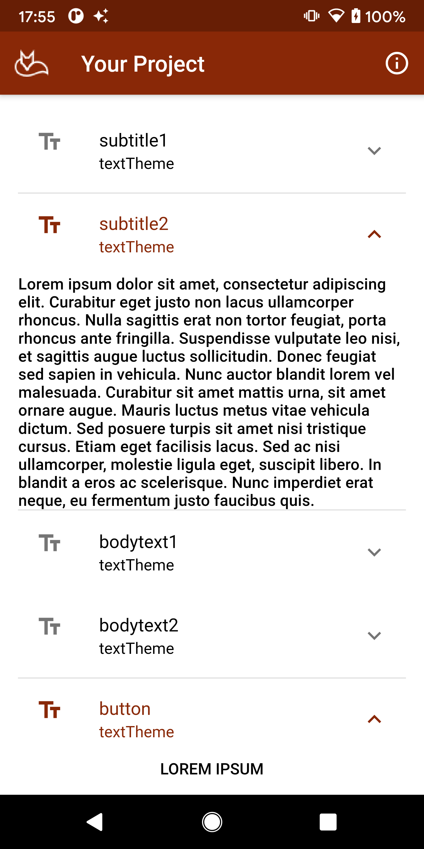
The dummy text on the home page of the app is themed. In the original version it was styled as headline6 — the Material 3 equivalent is titleLarge. The official Material 3 type scale documentation is the definitive reference for understanding how these roles map to visual hierarchy.
Material 3 type scale for Flutter
The most important discipline when using Flutter's text system is consistency. The Material Component widgets (MDC-Flutter) bake in padding, sizing, and spacing assumptions based on these roles. If you override them arbitrarily, the result looks subtly wrong to users even if they can't articulate why — and that friction shows up in reviews.
The table below reflects the current Material 3 TextTheme as implemented in Flutter. The default typeface remains Roboto on Android; on iOS, SF Pro is used via the platform default.
| NAME | SIZE | WEIGHT | LINE HEIGHT |
|---|---|---|---|
| displayLarge | 57.0 | regular | 64.0 |
| displayMedium | 45.0 | regular | 52.0 |
| displaySmall | 36.0 | regular | 44.0 |
| headlineLarge | 32.0 | regular | 40.0 |
| headlineMedium | 28.0 | regular | 36.0 |
| headlineSmall | 24.0 | regular | 32.0 |
| titleLarge | 22.0 | regular | 28.0 |
| titleMedium | 16.0 | medium | 24.0 |
| titleSmall | 14.0 | medium | 20.0 |
| bodyLarge | 16.0 | regular | 24.0 |
| bodyMedium | 14.0 | regular | 20.0 |
| bodySmall | 12.0 | regular | 16.0 |
| labelLarge | 14.0 | medium | 20.0 |
| labelMedium | 12.0 | medium | 16.0 |
| labelSmall | 11.0 | medium | 16.0 |
Note: This uses the Roboto font rendered in a browser, which is only an approximation of how these styles will appear in a real app on device.
Migrating from the old names
If you are working with an existing codebase, here is a quick reference for the most common name changes. The old names were deprecated in Flutter 3.1 and have since been removed entirely.
headline1→displayLargeheadline2→displayMediumheadline3→displaySmallheadline4→headlineMediumheadline5→headlineSmallheadline6→titleLargesubtitle1→titleMediumsubtitle2→titleSmallbodyText1→bodyLargebodyText2→bodyMediumcaption→bodySmallbutton→labelLargeoverline→labelSmall
Running dart fix --apply in your project will handle many of these renames automatically, though you should review the output carefully since the semantic intent of some styles has shifted slightly alongside the rename.
Add each text style to the main page to see how they look
The Scaffold provides APIs for showing drawers, snack bars, and bottom sheets, and already carries a background colour and an AppBar. Let's add a ListView with ExpansionTile widgets to preview every text style on a real device. The approach is the same as before — but the style references are updated throughout.
body: Padding(
  padding: EdgeInsets.all(16.0),
  child: ListView(
    children: [
      ExpansionTile(
        leading: Icon(Icons.text_fields),
        title: Text('displayLarge'),
        subtitle: Text('textTheme'),
        children: [
          Text(
            'Lorem ipsum dolor sit amet, consectetur adipiscing elit.',
            style: Theme.of(context).textTheme.displayLarge,
          )
        ],
      ),
    ],
  ),
),
Repeat the ExpansionTile block for each of the fifteen styles, then collapse them into a single tile to see the full scale at a glance:
ExpansionTile(
  leading: Icon(Icons.text_fields),
  title: Text('textTheme'),
  subtitle: Text('All 15 Material 3 styles'),
  children: [
    Text('Lorem!',
      style: Theme.of(context).textTheme.displayLarge,
    ),
    Text('Lorem ipsum',
      style: Theme.of(context).textTheme.displayMedium,
    ),
    Text('Lorem ipsum',
      style: Theme.of(context).textTheme.displaySmall,
    ),
    Text('Lorem ipsum dolor sit',
      style: Theme.of(context).textTheme.headlineLarge,
    ),
    Text('Lorem ipsum dolor sit amet',
      style: Theme.of(context).textTheme.headlineMedium,
    ),
    Text('Lorem ipsum dolor sit amet, consectetur',
      style: Theme.of(context).textTheme.headlineSmall,
    ),
    Text('Lorem ipsum dolor sit amet, consectetur adipiscing elit.',
      style: Theme.of(context).textTheme.titleLarge,
    ),
    Text('Lorem ipsum dolor sit amet, consectetur adipiscing elit. Curabitur eget justo.',
      style: Theme.of(context).textTheme.titleMedium,
    ),
    Text('Lorem ipsum dolor sit amet, consectetur adipiscing elit. Curabitur eget justo.',
      style: Theme.of(context).textTheme.titleSmall,
    ),
    Text('Lorem ipsum dolor sit amet, consectetur adipiscing elit. Curabitur eget justo non lacus.',
      style: Theme.of(context).textTheme.bodyLarge,
    ),
    Text('Lorem ipsum dolor sit amet, consectetur adipiscing elit. Curabitur eget justo non lacus.',
      style: Theme.of(context).textTheme.bodyMedium,
    ),
    Text('Lorem ipsum dolor sit amet, consectetur adipiscing elit. Curabitur eget justo non lacus.',
      style: Theme.of(context).textTheme.bodySmall,
    ),
    Text('Lorem ipsum dolor sit amet, consectetur adipiscing elit. Curabitur eget justo non lacus.',
      style: Theme.of(context).textTheme.labelLarge,
    ),
    Text('Lorem ipsum dolor sit amet, consectetur adipiscing elit. Curabitur eget justo non lacus.',
      style: Theme.of(context).textTheme.labelMedium,
    ),
    Text('Lorem ipsum dolor sit amet, consectetur adipiscing elit. Curabitur eget justo non lacus.',
      style: Theme.of(context).textTheme.labelSmall,
    ),
  ],
),
The ListView and its ExpansionTile children handle layout automatically. Seeing every style rendered on a real device is the fastest way to develop an intuition for which role fits which piece of UI content.
Variable fonts and Google Fonts
One of the more significant improvements in recent Flutter versions is first-class support for variable fonts via the FontVariation class. Variable fonts encode multiple style variations — weight, width, slant, optical size, and more — in a single font file, which reduces bundle size and enables smooth animated transitions between styles.
To use a variable font, declare it in pubspec.yaml as usual, then pass FontVariation instances to the fontVariations parameter of TextStyle:
Text(
  'Variable weight example',
  style: TextStyle(
    fontFamily: 'RobotoFlex',
    fontVariations: [
      FontVariation('wght', 350.0),
    ],
  ),
)
If you prefer to pull fonts directly from Google Fonts rather than bundling them, the google_fonts package on pub.dev makes this straightforward. You can also use the Google Fonts type tester to preview variable font capabilities before committing to a choice. Be mindful of network font loading in production — the package supports bundling fonts as assets for offline reliability.
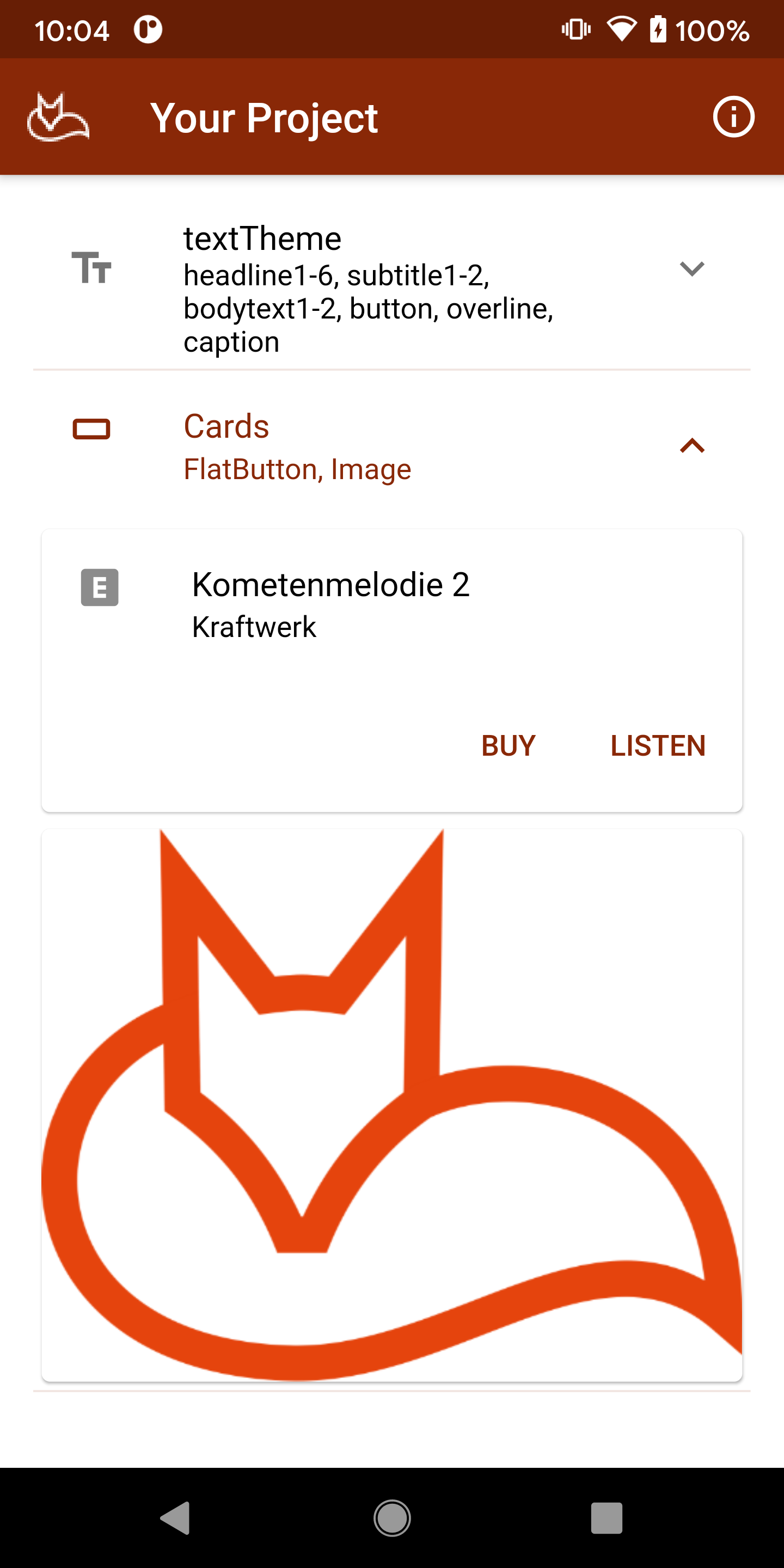
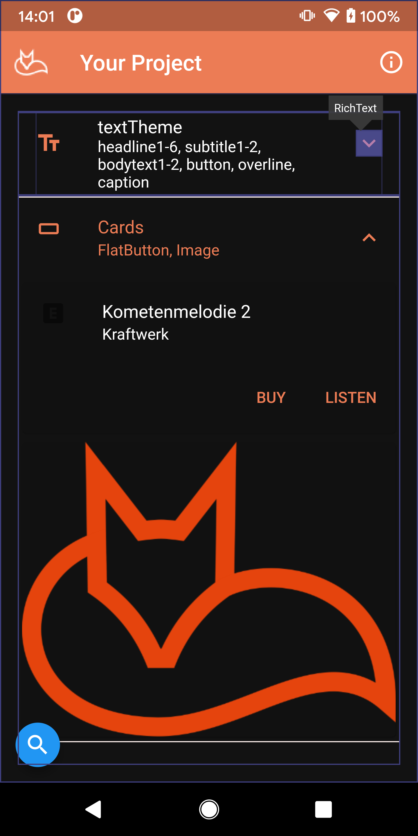
Add a Card
Cards are a fundamental surface component in Material 3, elevated above the background to contain related content and actions. Material 3 introduced three card variants — Elevated, Filled, and Outlined — giving you more expressive options than the single card style available previously.
Note that all appearance settings live outside this block; this is purely the card structure within its expansion tile. Also note that FlatButton and ButtonBar are both removed in current Flutter — replace them with TextButton and a Row or OverflowBar respectively:
ExpansionTile(
  leading: Icon(Icons.crop_7_5),
  title: Text('Cards'),
  subtitle: Text('Elevated, Filled, Outlined'),
  children: [
    Card(
      child: Column(
        mainAxisSize: MainAxisSize.min,
        children: [
          const ListTile(
            leading: Icon(Icons.explicit),
            title: Text('Kometenmelodie 2'),
            subtitle: Text('Kraftwerk'),
          ),
          OverflowBar(
            children: [
              TextButton(
                child: const Text('BUY'),
                onPressed: () {/* ... */},
              ),
              TextButton(
                child: const Text('LISTEN'),
                onPressed: () {/* ... */},
              ),
            ],
          ),
        ],
      ),
    ),
    Card(
      child: Image.asset('assets/ezone-512-transparent.png',
        fit: BoxFit.fill,
      ),
    ),
  ],
),
In Material 3, surface tones replace the elevation overlay approach used in dark themes under Material 2. Rather than lightening a surface by blending white at a given opacity, Material 3 uses tonal surface colours derived from your seed colour. This means dark-theme elevation is more consistent and easier to reason about — the applyElevationOverlayColor property that caused confusion in the original version of this article is no longer the primary mechanism.
Brand colour
The logo image in the card above carries the brand colour. Material 3's colour system is built around a seed colour from which an entire harmonious palette — primary, secondary, tertiary, error, and their container variants — is generated automatically via the ColorScheme.fromSeed constructor. This makes it straightforward to derive a full light and dark theme from a single brand colour, ensuring the logo always sits coherently within the palette rather than clashing with it.
Finding and fixing theme and colour problems with the UI
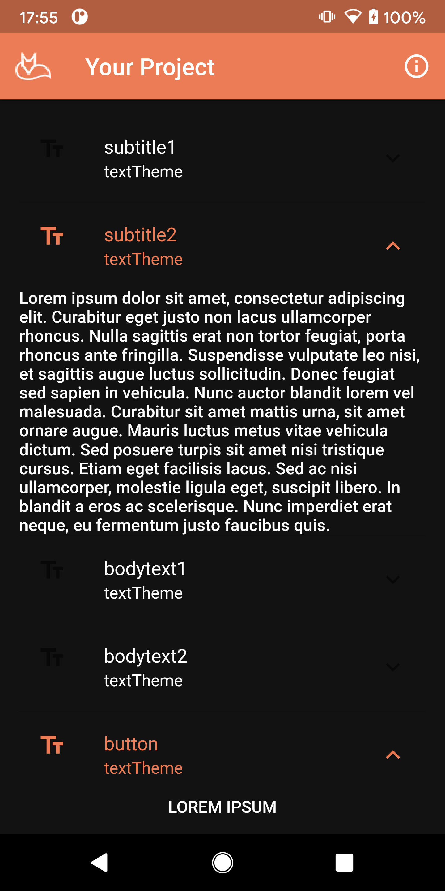
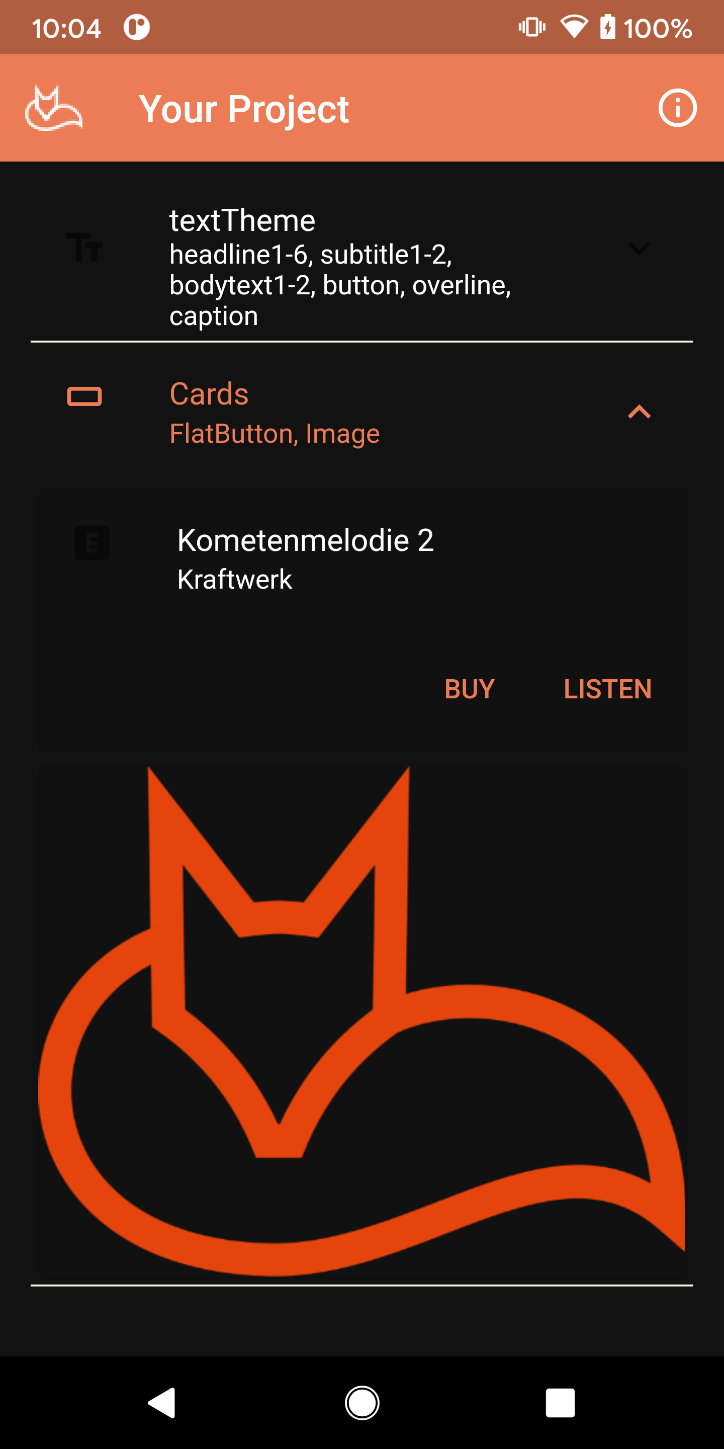
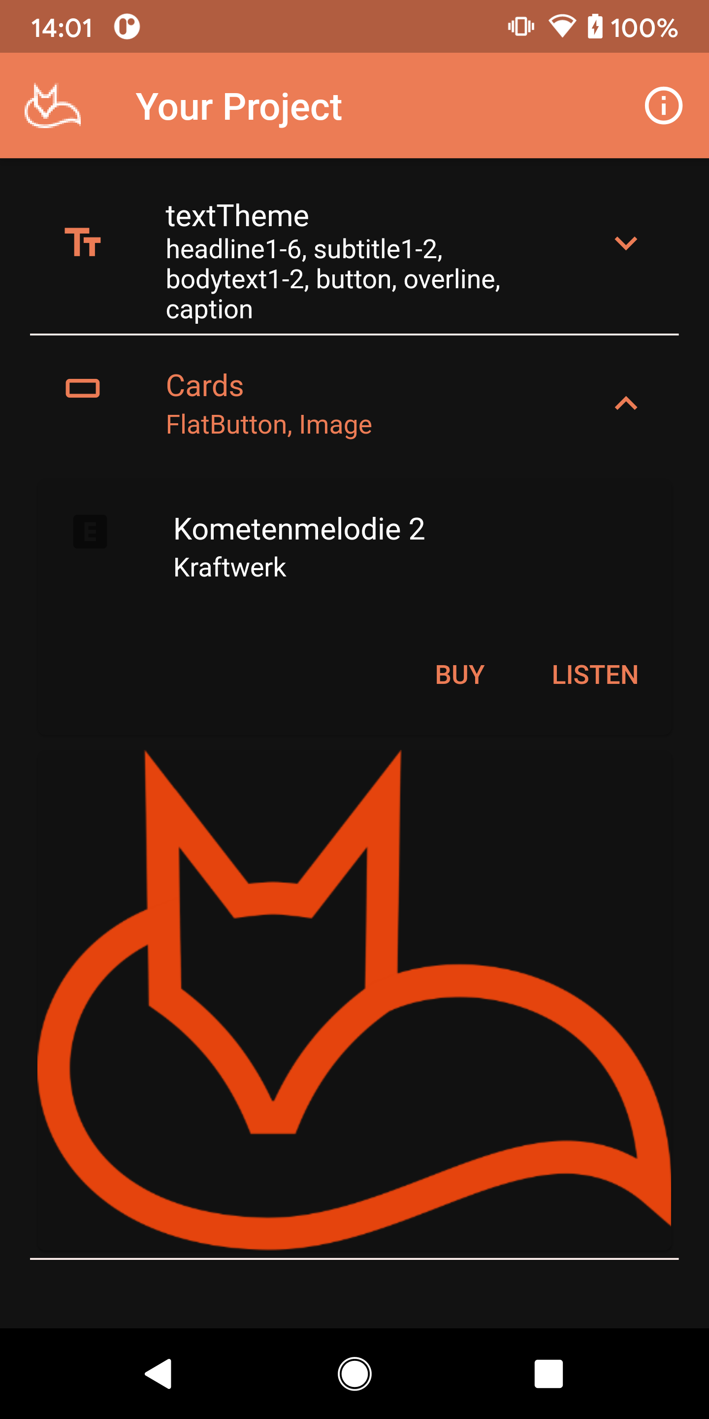
Look carefully at the screenshots and there is a visible issue: the expansion tile trailing icon is invisible in dark appearance but fine in light appearance. This points to a colour inheritance problem somewhere in the theme.
The most efficient way to track this down is the Flutter Inspector in your IDE. Open the inspector, select Widget Tree, and enable Select Widget Mode using the crosshair button. Tap the area where the missing element should appear and the tree will navigate directly to it, highlighting the widget on the running app surface simultaneously. From there you can inspect the widget's resolved colours and trace where they originate.
In this case the missing element is a TextSpan inside the ExpansionTile widget. A search for flutter expansiontile trailing icon dark theme on Stack Overflow surfaces several relevant threads — the consistent solution is to set unselectedWidgetColor in your dark ThemeData. Add it to the dark theme block and hot-reload to confirm the fix.
This kind of diagnostic work is genuinely useful beyond the immediate fix. Understanding how MDC-Flutter components inherit from ThemeData makes your theme definitions more robust and reduces the chance of similar surprises when you add new components later.
Continue adding components
As a way to build familiarity with the full range of Material component widgets, keep adding one of each to the page so you can see how they all behave together. With Material 3 now the default in Flutter, many components have updated visuals — rounded corners, tonal fills, and updated motion — so it is worth reviewing even components you have used before to see how they have changed.